
Many things may be essential for WRD, but the Media Queries is the core. Media Queries is the definition of styles, we mean "the responsiveness" of your Web, for devices. Each device needs a separate style to conserve its unique attribution. For instance, surfing Web using an iPad is not the same as using a PC, it is because the styles for those device are various. Let's imagine a very large width Web page appearing properly in your PC, but definitively it needs some changes in order to suit the quite small screen of an iPad. To solve this, we use method of Media Queries.
I am rich, have every kind of devices!
Of course, this technique is not very suitable to you! But in the sense of reality, let's talk about the the situation you are in the lack of time. So just using one responsive Webpage for your Phone or pulling out the old PC then read the useful information hidden in the left side of the Web..? Yes, you choose the first option, so do I!
With the requirement of each style applied to each device, Media Queries has its de-facto layouts, used broadly to make the rest simpler, below:
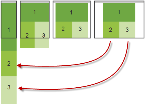
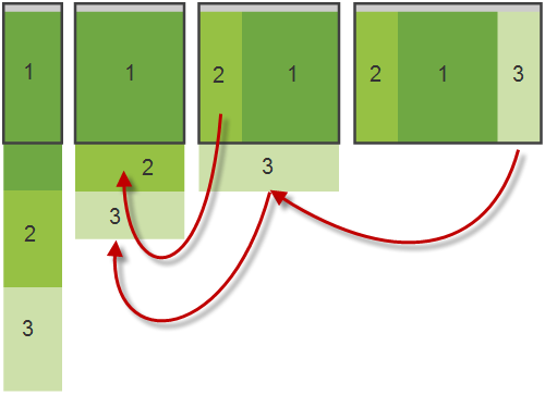
Layouts used for WRD.
This list includes four layouts, quite simple but useful in many cases. Each illustration has four parts, with right-to-left order, 1 for your PC, 2 for some smaller screen such as netbook or laptop, 3 for your smaller devices such as iPad or SS Galaxy and 4 for your phone such as iPhone or Androids.
Simplest
Simple
Quite simple
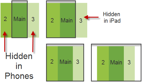
Commonest
Commonest is the usage in mobile devices that menu are hidden in the left and the right can be pop-ed out to the front after being touched.
Wildest device, i have devices i made by myself!
In some cases, you make something wildest, such as making your own phone or making your own iPad with 15'' screen! If so, WRD is Web solution for you! The list of devices that WRD supports and maybe expandable in the future.
List of devices used in WRD Media Queries
- screen: Designed for non-paged personal computer monitors.
- tty: Designed for mass media employing a fixed-pitch persona grid, for instance teletypes, terminals, or perhaps portable devices together with constrained exhibit capabilities.
- tv: Designed for television-type devices (lower decision, shade, constrained scrollability).
- projection: Designed for projectors.
- handheld: Designed for handheld devices (tiny screen, grayscale, bitmapped artwork, constrained bandwidth).
- print: Designed for paged, opaque substance and also regarding files looked at about screen inside print survey function.
- braille: Designed for braille tactile comments devices.
- aural: Designed for presentation synthesizers.
- all: Suited to all devices.
What does this mean? This is used in Media Queries to identify the screen that need to be responsive! For example, one like this:
<link rel="stylesheet" type="text/css" media="screen, 3d-glasses, print and resolution > 90dpi" href="/MagenTech-joomla-ipad.css">
will try to make responsive for at least 3 devices: screen, 3d-glasses and print. At this time, we have not 3d-glasses as supported devices but declaration is for future! And remember that screen and print is the most used ones in the industry.
"Using Android for surfing Pictures, does this help? Yes, it does!"
Certainly, it is not visitors' task, it is provider's role in supplying images adapting to your devices. It helps his Web load smoothly and your surfing look seamlessly!
In order to do this, many technique can be used, for example, this is a way of using pictures handled by java-script. In this case, these seem to be a very great advantage to visitors!
Girl, angry with big picture :)
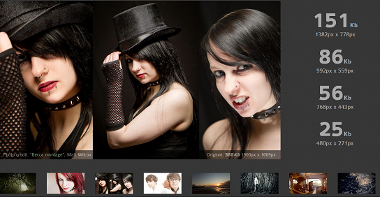
Pay attention to bytes and the time to load, it is reduced and can make your visitors happier with your Website!
What we do
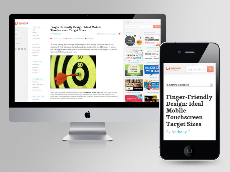
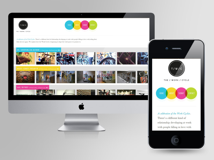
We are about to release flexible responsive Joomla templates with reasonable price. It requires some effort but soon to come out. In the meantime, these are ones we get inspiration from, each has its look in the PC and in the Phone, respectively.
Smashing Magazine - Online magazine
The Work Cycle - News and application
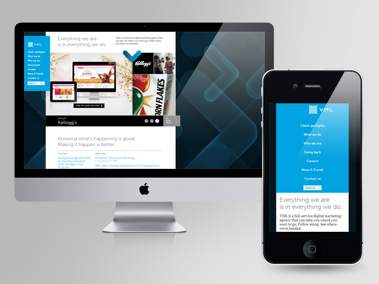
VML - Digital marketing
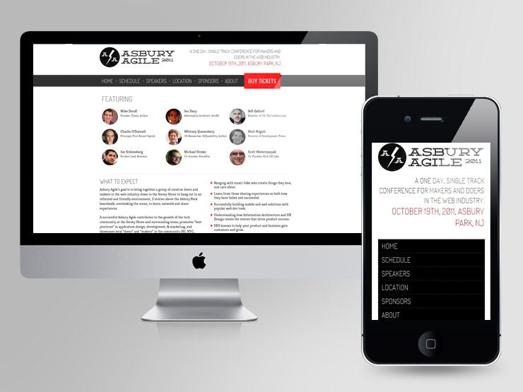
Asbury Agile - Web conference
There will be more in the next post. Happy reading!

