
Definition
Recently, a new definition has been emerged, Web Responsive Design (WRD). It is a new architecture of layout, coding and designing Websites. The main purpose of this idea is producing Websites that can be changed according to the customer's devices and bring new experience to visitors despite of their devices' limitation (screen size, color...).
In order to do that, we present here some terms we need to handle before going with WRD.
Glossary
The list for those concerning about WRD trend, sorted in the relevant order:
- Responsive web: web that adapts to many devices, including but not limited to 3 main tasks:
- Changing layout
- Reducing images (dimensions and bytes)
- Executing media queries
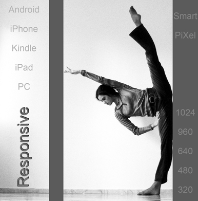
- Layout: the way you re-position the blocks on your Web. For example:
Ex1:
The first is your Website in the beginning with desktop PC, you want it look like the second on your nice Android phone?
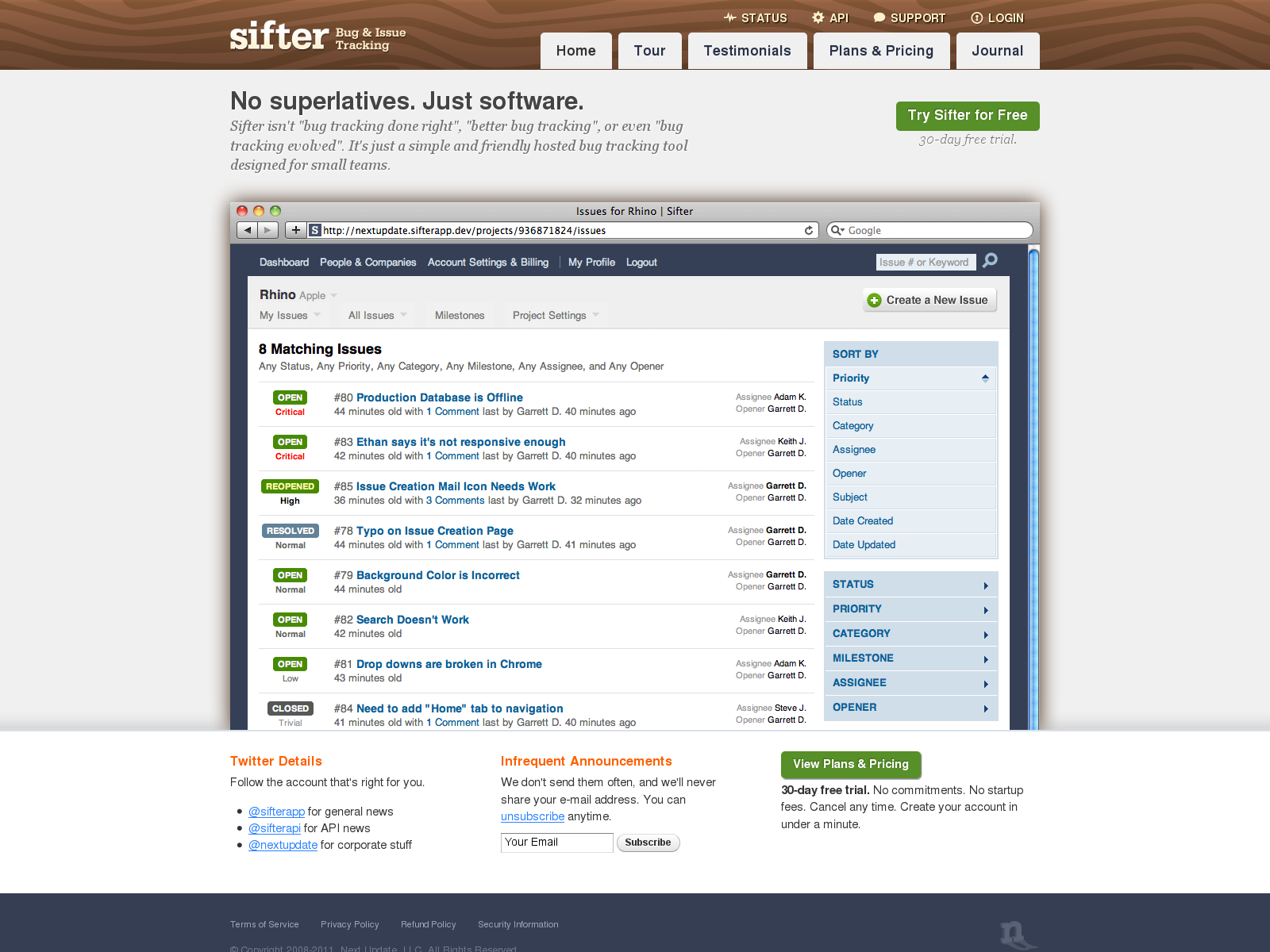

(These screenshots captured from sifterapp. Click to view larger one)
Notice to the changes made to menu, and the mailing-list disappeared in the second picture. The menu in the second screenshot definitively suits the mobile suffer's needs; why need very large and redundant menu if all you have is screen with 360 even 240 pixels! And the change to the mailing list disappeared also is highly recommended because this type of subscription usually leads to several pop-ups, it is not smooth in the mobile devices, of course.
Hereafter is another example
Ex2:
The first picture is the layout of your Website in your laptop and the second one is for your iPad!
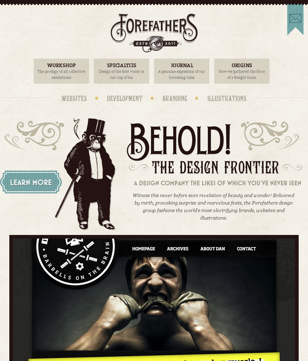
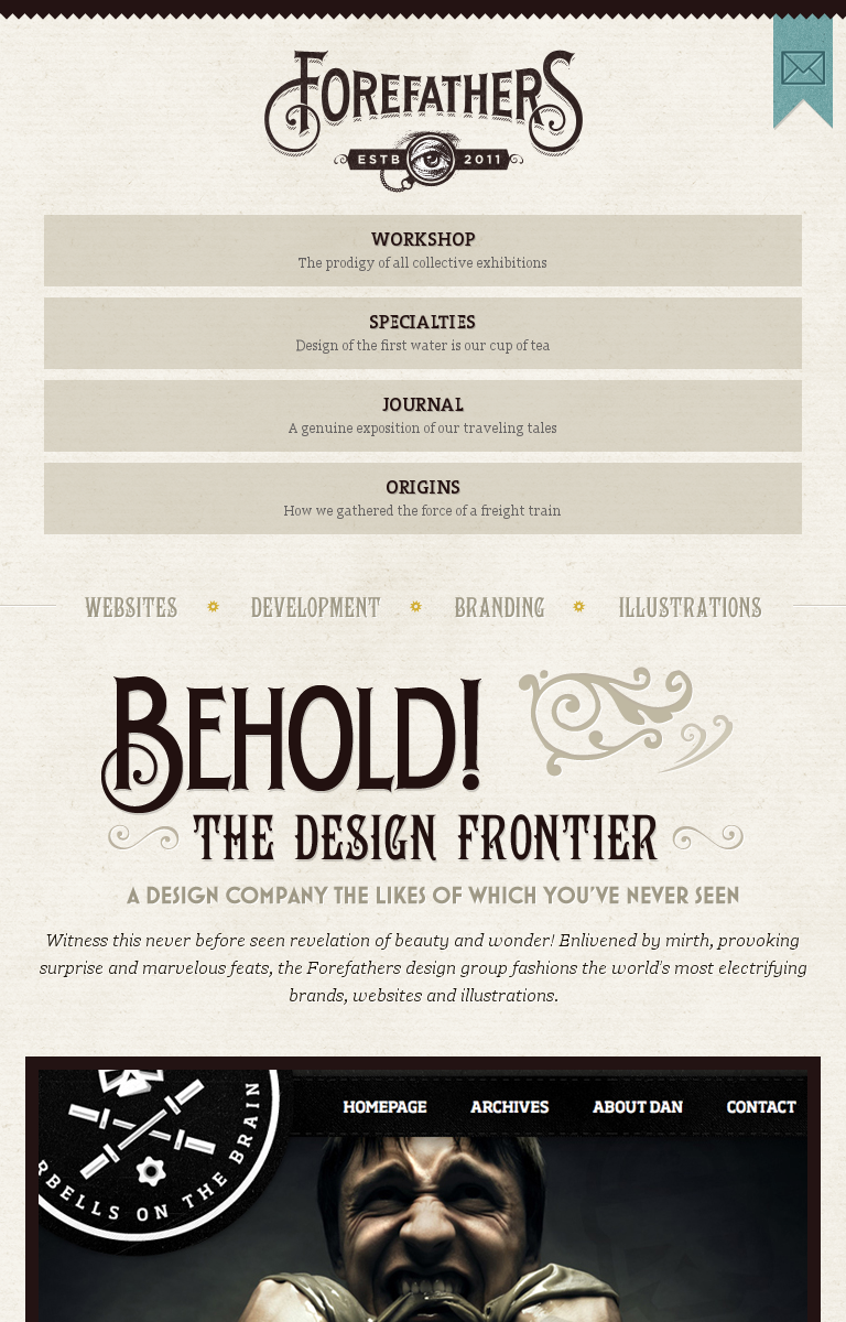
(These screenshots captured from forefathersgroup. Click to view larger one)
Here we notice the changes made to menu, but more impressively, there is disappearing of chimp image and "Learn more" button!
Why can we do that? By manually change the code for each device, OR by typing <img> tag to each template code?
No, it is made semi-automatically by WRD, with pre-defined style applied to each device. It is a media query that described later.
- The layout is done, how about the images reducing? Do you notice that for each device, the image seems to fit screen size instead of make some redundant scrolling out of the bar? Yes, we can do this simply by using height and width attribute, but this is not WRD!
Why we need to do, because:
- Devices' screen size is various. Of course, we need particular image size for each screen size.
- The more reducing you make, faster your visitors surf your Web.
The solution: Use js script to handle the images size before output.
- Now, we have all things to execute media queries for devices. From HTML4 and CSS2, supporting media-dependent style sheets tailored for different media types is available. What is media queries? For example, a page may use sans-serif fonts when displayed on a screen and serif fonts when printed. In this case, ‘screen’ and ‘print’ are two of many media types that have been defined, and they are the object for executing media queries! This is a bit technical, in which you insert each css <link rel> for each device you want to be responsive!
<link rel="stylesheet" type="text/css" media="screen" href="/sans-serif.css">
<link rel="stylesheet" type="text/css" media="print" href="/serif.css">
@media screen {* { font-family: sans-serif }}
Application
In the future, we will create several templates using RWD as guide-line. That will be available first for Joomla for sure and maybe Magento later. Certainly, these need much effort to create brilliant RWD template, but wait us a little only.
In the meantime, happy reading!


