

People enter virtual reality for many reasons. All of us check e-mails, run social media profiles, play games, listen to music, watch videos, search for information, shop and carry out lots of other important activities. People spend a lot of time online, and that’s why web developers strive to make their virtual world even more attractive than the real one. Users have become spoilt by these somewhat unrealistic creations, and if your website doesn’t meet their expectations, they just abandon it no matter what you offer or how competitive your prices are.
To make a long story short, we are going to tell you about 10 trends of Joomla template designs to which you should adhere should you want your website to look good, be stylish and thrive well.
1. Stunning imagery
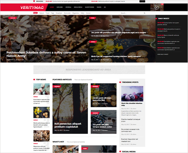
Quality images are extremely important if you want your website look professional and expensive. Have a look at this design SJ VerityMag - Free Responsive Joomla Template. First of all, its images grab user’s attention. They perfectly convey website feel and atmosphere. Pictures illustrate or entirely replace the text. People understand what the article is about even without reading it. Big HD images are especially appropriate on minimalist websites.
2. Extraordinary design
With all this abundance of artistic design available on the web, it’s really difficult to surprise the user. However, the author of Family Center Free Joomla Template has managed to do that. Let’s have a closer look at the theme designed by TemplateMonster’s team.
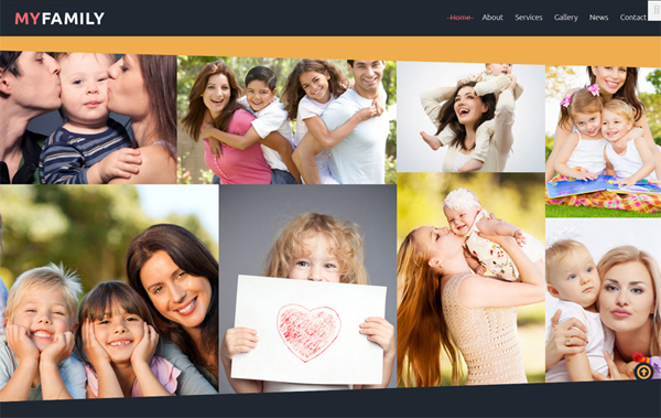
First of all, the theme draws our attention to the combination of cheerful, bright colors. Then we notice geometry experiments. Here we mean not only oblique lines that separate one content area from another, but also a mix of different photo shapes. The theme not only has a slider, but also the embedded video to spark the user’s interest even more. Please note the unusual animated effect that is revealed on hovering main menu items. Overall the theme can be called impressive, and we are sure that the website, built on this platform, will stay in users’ minds for a long time.
3. Dynamic web pages
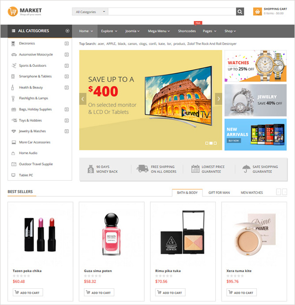
Click this link and see a wonderful example of dynamic web page SJ Market - Responsive eCommerce Joomla Template. Each and every element responds user’s actions. Such kind of interaction prompts the visitor his/her next step. Dynamic websites are user-friendlier and easier to navigate. Sliders perfectly showcase the offered products. Animation and hover effects make user’s travel through the site pages much more interesting. Modern technologies let the developers create mind-boggling visual effects that engage the viewers.
4. Oversized layouts
When we say ‘oversized layouts’, we mean that today web design elements have become bigger and the spaces between them have become larger. These kinds of layouts look really great on widescreen desktop monitors. Additionally, they are easier to navigate and read on mobile gadgets. What’s more, big elements are eye-catching. Seeing them, the users are more likely to scroll down and check out the rest of your content. Images also became huge and suggest quality. Visitors like to see full-screen photo slideshows and video previews right on the home page. They work as brief insights into the company and its services. Undoubtedly, larger typography provides better readability. As we have already mentioned above, this aspect is especially important for mobile gadget users. Media queries automatically adjust the font sizes to the size of the gadget screen. On desktop computers big fonts simply allow users to move through the site and read the text more quickly, without straining their eyes.
See the excellent representation of this trend in the following template: SJ Papa - Responsive Joomla Template.

5. Minimalism
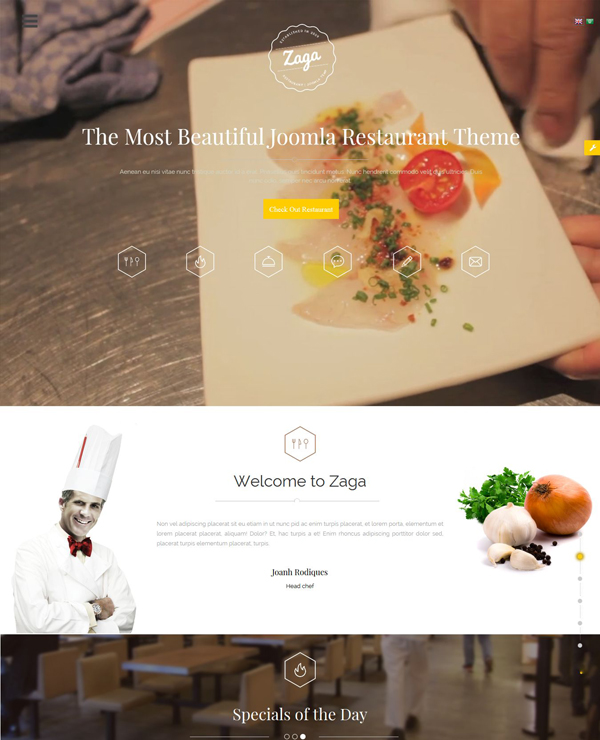
Minimalism is the case where ‘less is more’. It is very popular nowadays, but it’s really complex to create a decent minimalist website. The essence is in finding a perfect balance of usability and minimalist aesthetics. In other words, you should provide the highest level of functionality with minimal interface elements. Here are the tools a designer has at hand for this purpose. Lots of negative space, striking typography and overall focus on content. That’s it. Minimalism is frequently coupled with flat style. They complement each other perfectly. We will illustrate the trend with a good example to make what we are trying to say more understandable.
Minimalist restaurant theme designs can also look delicious. SJ Zaga - Responsive Joomla Template is a gorgeous demonstration of the trend.
6. White space
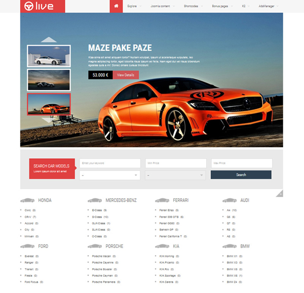
It is a fact, the proper usage of white space or “negative” space in web design can work wonders. In web design terms, it’s represented by the space between graphics, columns, images, text, margins and other elements. By the way, blank space shouldn’t necessarily stay white. It may be filled with any color as long as it is free of any elements like text or images. Why is it so important to leave enough space untouched on your web page? Because white space smoothes things out and transforms a page into something elegant. It makes the designs simpler, but more beautiful as they are free from clutter. White space helps the designer deliver a clear and direct message to the user. Extra decorations distract the viewer, while white space focuses his/her attention on the product or service you offer. It’s safe to say that white space improves the user experience as having space to breathe between elements lets your reader’s eyes relax.
Here is a wonderful example of the correct use of white space. SJ Live - Responsive Joomla Template.
7. Parallax
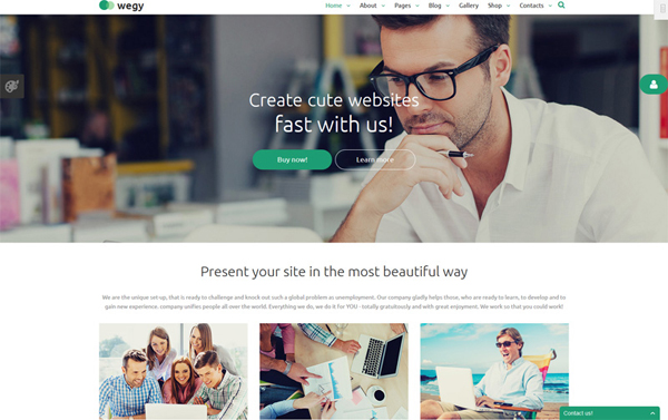
With technologies like HTML5 and CSS3, it’s become possible to create advanced, interesting and remarkable visual effects. Parallax is one of them. The trick with Parallax is that the background is moving at a slower rate to the foreground, creating an optical illusion of a 3D environment. If you want to impart depth and realism to your website, use Parallax. Websites with this effect look really spectacular. They have magnetic appeal for the user and provide fuller immersion in the atmosphere you create. Parallax was adopted by ordinary websites from video games, which involved the users and didn’t let them go until the game was over. This almost real experience will make your customers come to your website every now and again. Just give it a try.
And don’t forget to see how impressive Parallax effect looks. This Wegy Joomla Template perfectly illustrates the last trend on our list.
8. Flat design
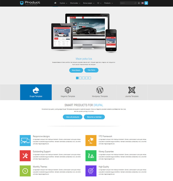
Flat design hasn’t lost its popularity for several years in a row. Flat interfaces without any stylistic elements, that give the illusion of three dimensions, have flooded the Internet. The trend is focused on a minimalist use of simple elements, typography and flat colors. Why do designers prefer flat style? Because it allows the designer to create more streamlined and efficient interfaces. It is easier to convey information on your site quickly while it will still look visually appealing and approachable with flat style. What’s more, it makes it easier to design a responsive interface that changes in browser size across different devices. Flat design style uses a limited number of tools, so with minimal design elements, websites inherit the ability to load faster and resize more easily, and still look sharp on high-definition screens.
Would you like to see a good example of flat design style application? Click this link and see SJ Product - Responsive Joomla Template.
9. Lazy load
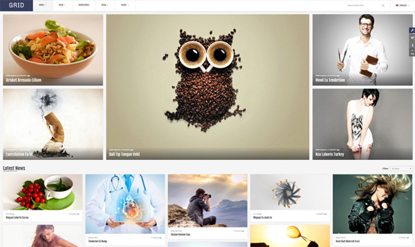
Infinite pages are frequently used nowadays. Users just like to scroll down instead of clicking or tapping main menu items. However, it may also be very irritating to wait until the site content has downloaded - especially when you are in a hurry. Lazy load completely solves this problem. The plugin delays loading of images on long web pages. That is, images outside of the viewing area are not loaded until the user scrolls to them. Using Lazy Load on long web pages makes the page load faster. In some cases it can even help to reduce server load.
Here is a nice example of a template, where you can see Lazy Load in action. SJ Grid - Responsive Joomla Template
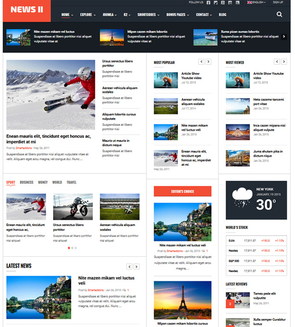
10. Grid layouts
Next up we have layouts built on modular or grid-like structures. In such designs each module is intended to flex based on the screen size. This isn’t really a completely new approach, but the introduction of responsive web design has made it even more useful. You can create grid layouts with plugins like Masonry, for instance. This example perfectly demonstrates the idea SJ News II - Free Responsive Joomla Template. This theme for a news site is content-rich, but it looks clean and structured. The viewer can notice an accurate content architecture/hierarchy, which makes it easy to scan, read and comprehend.
Of course there are many more Joomla template design trends to recap, but we highlighted 10 of the biggest ones from our viewpoint. Have anything to add? Your comments are always welcome at the comment section. Please feel free to share your thoughts on the contents of this blog post. Was it useful to you? Do you agree that those 10 trends are the “must” for Joomla template designs? Do you use some or maybe even all of them? Speak up! Your feedback will be appreciated by the web community and the author of this article.
***
Author’s Bio:
Helga Moreno is one of the ardent members of the friendly copywriters’ society. She has a very curious nature and a long list of topics waiting to be featured. She constantly researches in order not to miss a thing happening in the world of web design and development… Visit her Google+ account, she will be happy to add you to her circles.


