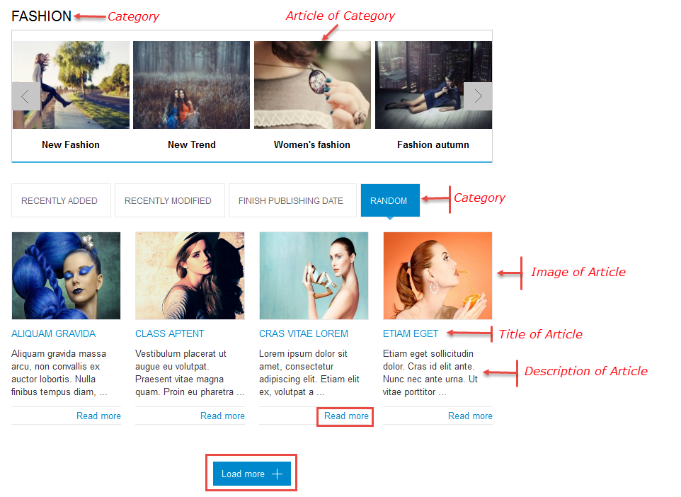
3.1 Below is module layout
3.2 Module Configuration
Note:We used the images of module’s installation on Joomla 3.x to illustrate.
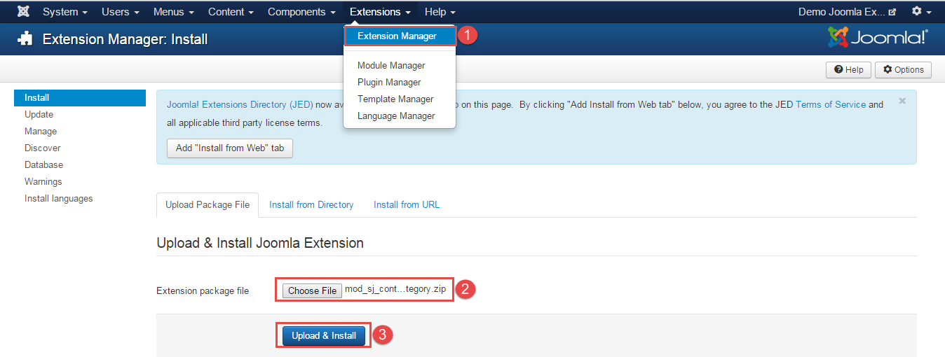
After installing, go to Extensions -> Module Manager and find SJ Super Category for Content to configure.SJ Super Category for Content module is configured in 7 main groups of parameters as following:
- Module.
- Source Options.
- Category Options.
- Items Options.
- Image Options.
- Effect Optionss.
- Advanced.
Let’s look at the parameters in detail:
Module.
- Link Target – Allow to choose one of three:
- New window.
- Same window.
- Popup window.
- # Column – Allow to set number of column for each device:
- For devices have screen width from 1200px to greater.
- For devices have screen width from 768px up to 1199px.
- For devices have screen width from 480px up to 767px.
- For devices have screen width less than or equal 479px.
- Type show – Allow to choose one of two: Load more or Slider
- Rows – Allow to set number of row for slider
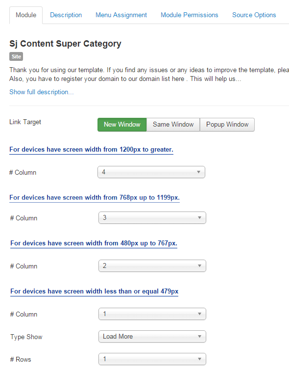
Source Options.
- For Category
- Category – Allow you to select Category.
- Category Depth – The number of child category levels to return.
- For Field Article
- Product Field to show tabs – You can choose article which you want to show
- Field Preload – You can choose the article which you want to show by the first.
- Ordering Direction – Select the direction you would like Articles to be ordered by.
- Featured Articles – Allow to select to show, hide or only display Featured articles.
- Count – Maximum number of articles to display. Enter “0” for unlimited.
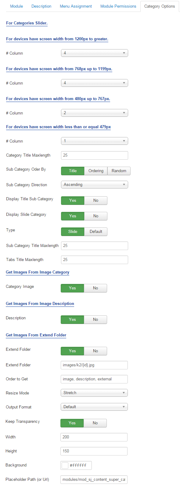
Category Options.
- For Categories Slider
– Allow to set number of column for each device:
- For devices have screen width from 1200px to greater.
- For devices have screen width from 768px up to 1199px.
- For devices have screen width from 480px up to 767px.
- For devices have screen width less than or equal 479px.
- Column For devices have screen width less than or equal 479px.
- Category title maxlength :The maxlength of Category’s title. Set “0″ to show full title.
- Sub Category Order By – Allow to choose 1 of 3: Name/Odering/Random.
- Sub Category Direction – Allow to choose Category Direction: Ascending/Descending.
- Display Title Sub Category – Allow to show/hide title of sub category.
- Display slide category – Allow to show/hide slider of category.
- Type – Allow to choose one of two : Slide or Default
- Sub Category Title Maxlength: The maxlength of Sub Category’s title. Set “0″ to show full title.
- Tabs Title Maxlength: The maxlength of Tabs Title. Set “0″to show full title.
- Get Images From Image Category
- Image Category – Allow to show image category OR not.
- Get Images From Image Description
- Description – Allow to show image description OR not.
- Get Images From Extend Folder
- Extend Folder – Allow to show/hide Extend Folder.
- Extend Folder – Set path to external image folder used by option above.
- Order to Get – Order to Get image.
- Resize Mode – Allow to choose the mode of image resizing.
- Output Format – Output Format after resizing.
- Keep Transparency – Allow to keep transparency of image OR not.
- Width – Allow to set width of image.
- Height – Allow to set height of image.
- Background – Allow to set the color of image background.
- Place holder Path (or Url) – The path or URL of Default Image.
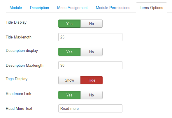
Items Options.
- Title Display – Allow to show/hide title of items.
- Title Maxlength – The maxlength of items’s title. Set “0″ to show full title.
- Description Display – Allow to show/hide Description of items.
- Decription Maxlength – The maxlength of items’s decription. Set “0″ to show full title.
- Tags Display – Allow to show/hide Tags of items.
- Readmore Link – Allow to show/hide a link of article.
- Read More Text – Allow to set Readmore text.
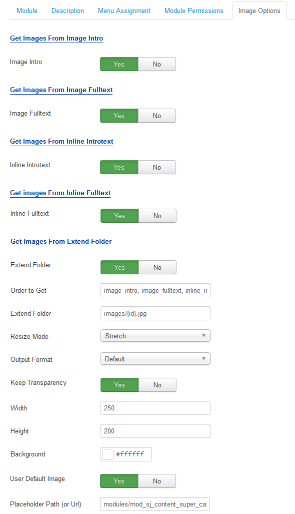
Image Options.
- Get Images From Image Intro
- Image Intro – Allow to show image articles OR not.
- Get Images From Image Fulltext
- Image Fulltext – Allow to show Image Fulltext OR not.
- Get Images From Inline Introtext
- Inline Introtext – Allow to show image inline introtext OR not.
- Get Images From Inline Fulltext
- Inline Fulltext – Allow to show image inline fulltext OR not.
- Get Images From Extend Folder
- Extend Folder – Allow to show/hide Extend Folder.
- Order to Get – Order to Get image.
- Extend Folder – Set path to external image folder used by option above.
- Resize Mode – Allow to choose the mode of image resizing.
- Output Format – Output Format after resizing.
- Keep Transparency – Allow to keep transparency of image OR not.
- Width – Allow to set width of image.
- Height – Allow to set height of image.
- Background – Allow to set the color of image background.
- User Default Image – Allow to use Default Image or not.
- Place holder Path (or Url) – The path or URL of Default Image.
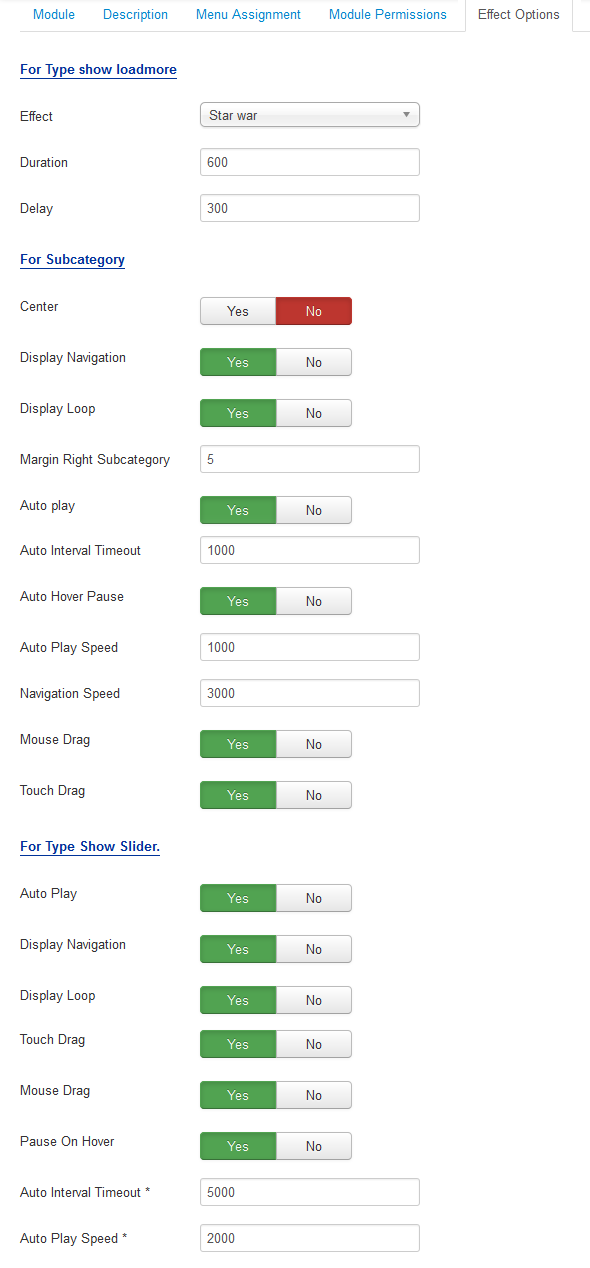
Effect Options.
- For Type show loadmore
- Effect – Allow to select effect of module in list box.
- Duration – Allow to set how long animation will run (Lager = Slower).
- Delay – Allow to set a timer to delay the excution of the next item in the queue (Lager = Slower).
- For Sub Category/For Type Show Slider.
- Center – Allow to show/hide article center for slider.
- Display Navigation – Allow to show/hide navigation for slider.
- Display Loop – Allow to run a loop or not.
- Margin Right Sub Category – Allow to set margin right for sub category.
- Auto Play – Allow to Enable/Disable auto play or not.
- Auto Interval Timeout – Allow to set auto interval timeout of slider or not.
- Auto Hover Pause– Allow to pause effect when the user hovers.
- Auto Play Speed – Allow to set speed of auto play.
- Navigation Speed – Allow to set speed of navigation.
- Mouse Drag – Allow to Enable/Disable mouse drag.
- Touch Drag – Allow to Enable/Disable touch drag.
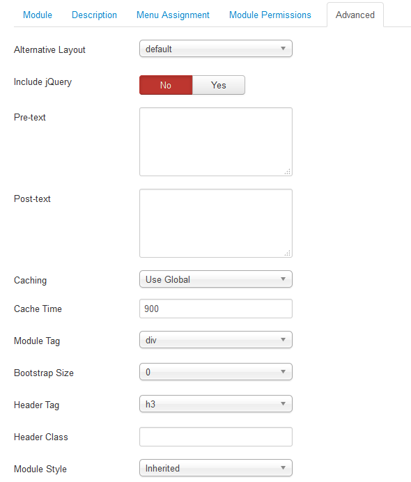
Advanced Options.
- Alternative Layout – Set custom layout for this module.
- Include Jquery – Allow you to include Jquery OR NOT.
- Pre-text – The content to show at the top of module.
- Post-texl – The content to show at the end of module.
- Caching – Select whether to cache the content of this module.
- Cache Time – The time in seconds before the module is recached.
- Module Tag – Allow to select the HTML Tag for module.
- Bootstrap Size – Allow to set the number of columns that module will use.
- Header Tag – Allow to select the HTML Tag for module header/title.
- Header Class – Support the CSS Class for module header/title.
- Module Style – Select module style.