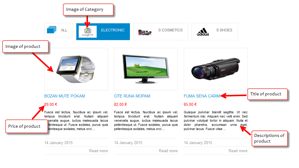
3.1 Below is module layout
3.2 Module Configuration
Note:We used the images of module’s installation on Joomla 3.x to illustrate
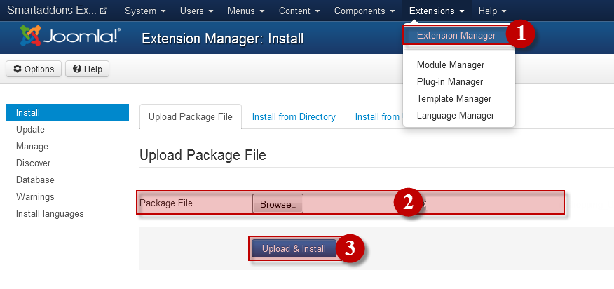
After installing, go to Extension -> Module Manager and find SJ Listing Tabs for Joomshopping to configure.
SJ Listing Tabs for Joomshopping module is configured in 7 main groups of parameters as following:
- Module Options
- Source Options
- Tabs Options
- Products Options
- Image Options
- Effect Options
- Advanced Options
Let’s look at the parameters in detail:
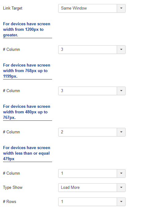
Module Options
- Link Target – Allow to set target for links:
- New Window
- Same Window
- Popup Window
- # Column – Allow to set number of column for each device:
- For devices have screen width from 1200px to greater.
- For devices have screen width from 768px up to 1199px.
- For devices have screen width from 480px up to 767px.
- For devices have screen width less than or equal 479px.
- #Type shows – The Type shows when you click on the type show:
- #Rows – Allows you to configure the number of lines for the slider type.
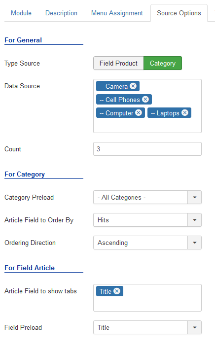
Source Options
- For General
- Type Source – Allow to choose type source.
- Field Article – Allow to arrange product according to the product fields(Name, ID, Price and Ordering)
- Category – Allow to arrange product according to the categories
- Data Source – Allow to select category which you want to show in this module.
- Count -The number of articles to display.
- For Category – If you choose Type Source: Category, you need to fill params below:
- Category Preload – Allow to select preload category.
- Article Field to Order By – Allow to sort order by Name, ID, Price, ect.
- Ordering Direction – Allow to select ordering direction .
- For Field Product – If you choose Type Source: Field Product, you need to fill params below:
- Article Field to show tabs – Allow to select product field which you want to show in this module.
- Field Preload – Allow to select preload field.
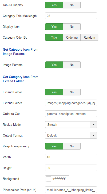
Tabs Options
- Tab All Display – Allow to display tab All OR not.
- Category Title Maxlength – The maxlength of category’s title. Set “0″ to show full title.
- Display Icon – Allow to display category’s icon OR not.
- Category Order By – Allow to order categories by
Image Options
- Get Category Icon From Image Params
- Image Params – Allow to show category icon in image params OR not.
- Get Category Icon From Extend Folder
- Extend Folder – Allow to show/hide Extend Folder.
- Extend Folder – Set path to external image folder used by option above.
- Order to Get – Order to Get image.
- Resize Mode – Allow to choose the mode of image resizing.
- Output Format – Output Format after resizing.
- Keep Transparency – Allow to keep transparency of image OR not.
- Width – Allow to set width of image.
- Height – Allow to set height of image.
- Background – Allow to set the color of image background.
- Place holder Path (or Url) – The path or URL of Default Image.
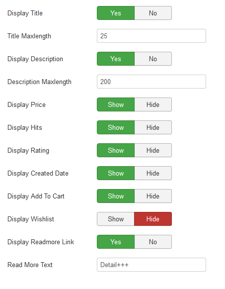
Product Options
- Display Title – Allow to display title of product OR not.
- Title Maxlength – The maxlength of product’s title. Set “0” to show full title.
- Display Description – Allow to display description of product OR not.
- Description Maxlength – The max length of product’s description can be showed.
- Display Price – Allow to show/hide product’s price OR not.
- Display Hits – Allow to show/hide the hits OR not.
- Display Rating – Allow to show/hide rating OR not.
- Display Created Date – Allow to show/hide product’s created date OR not.
- Display Add To Cart – Allow to display add to cart button OR not.
- Display Wishlist – Allow to display wishlist button OR not.
- Display Readmore Link – Allow to show/hide link for readmore.
- Read More Text – Allow to insert the text for readmore link.
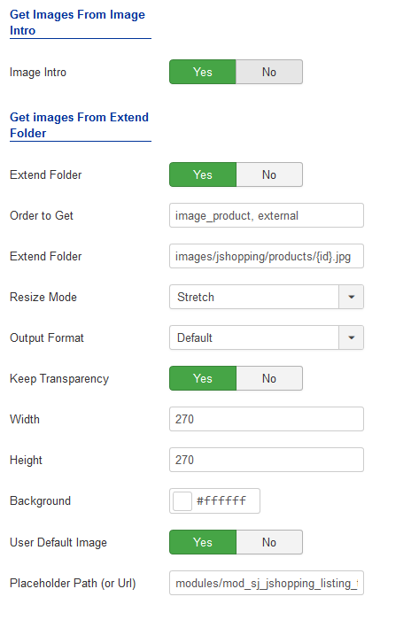
Image Options
- Get Images From Image Intro
- Image Intro – Allow to show/hide image of product.
- Get Images from Extend folder
- Extend Folder – Allow to show/hide Extend Folder.
- Extend Folder – Set path to external image folder used by option above.
- Order to Get – Order to Get image.
- Resize Mode – Allow to choose the mode of image resizing.
- Output Format – Output Format after resizing.
- Keep Transparency – Allow to keep transparency of image OR not.
- Width – Allow to set width of image.
- Height – Allow to set height of image.
- Background – Allow to set the color of image background.
- Place holder Path (or Url) -The path or URL of Default Image.
Effect Options
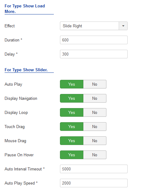
- Effect – Allow to select effect of slider in this listbox.
- Duration – Allow to set how long animation will run (Lager = Slower).
- Delay – Allow to set a timer to delay the excution of the next item in the queue (Lager = Slower).
- For Type Show Slider.
- Auto Play – Allow to Enable/Disable autoplay mode.
- Show Navigation – Allow show/hide Navigation for module.
- Display Loop – Allow to show/hide Loop for slider.
- Touch Drag – Allow to set the touch drag on the smart devices OR not.
- Mouse Drag – Allow to Enable/Disable the mouse drag OR not.
- Pause On Hover – Allow slideshow effect stop when hover OR NOT.
- Auto Interval Timeout – Allow to set the speed of timer. Larger = Slower.
- Auto Play Speed – Allow to set speed of auto play.
Advanced Options
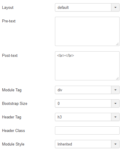
- Layout – Set custom layout for this module
- Pre-text – The content to show at the top of module.
- Post-text – The content to show at the end of module.
- Module Tag – Allow to select the HTML Tag for module.
- Bootstrap Size – Allow to set the number of columns that module will use.
- Header Tag – Allow to select the HTML Tag for module header/title.
- Header Class – Support the CSS Class for module header/title.
- Module Style – Select module style.
Thank you so much for purchasing this module. If you have any questions that are beyond the scope of this help file, please send us via: Submit a Ticket
Thanks so much!