3.1 Below is module layout
3.2 Module Configuration
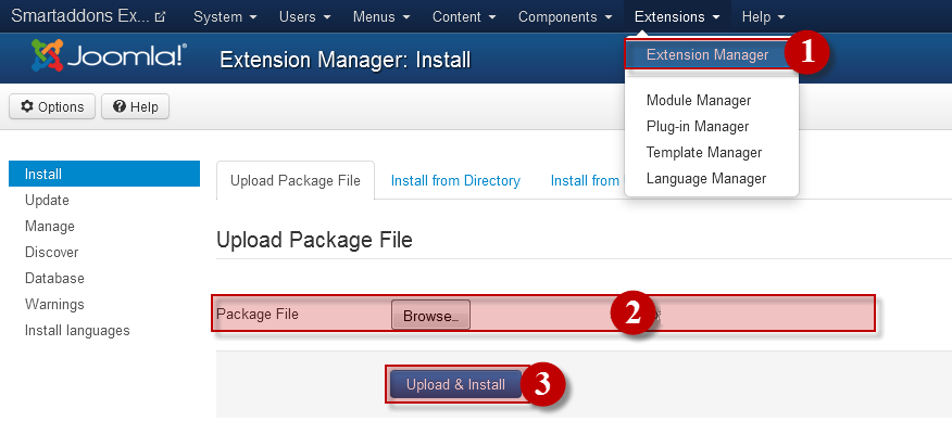
Note:We used the images of module’s installation on Joomla 3.x to illustrate
After installing, go to Extension -> Module Manager and find SJ K2 Mega Slider to configure
SJ K2 Mega Slider module is configured in 7 main groups of parameters as following:
- General Options
- Source Options
- Item Options
- Navigation Options
- Image Options
- Effect Options
- Advanced Options
Let’s look at the parameters in detail:
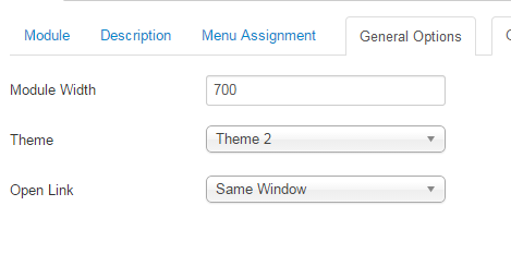
General Options
- Module width – Allow to set the width of the module
- Theme – Allow to choose one of four themes available
- Open Link – Set target for links:
- New Window
- Same Window
- Popup Window
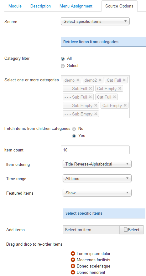
Source Options
- Source – Allow to choose one of two
- Retrieve items from category
- Select specific items
- If you choose : Retrieve items from category, you need to fill params below:
- Category filter – : allow to select one or all category in component
- Fetch items from children category – Allow to choose children categories or not
- Select one or more categories-Choose the category which you want to show in this module
- Item count – Allow to select the number of items to display. Set “0” to display all items
- Item Ordering – Allow to sort order by Default, ect
- Time range -Allow to set time range if odering is set to most popular or most commented
- Featured item -Allow to show/hide or show only featured item
- If you choose : Select specific items, you need to fill params below:
- Add item – Allow to choose items from list item in K2 component
- Drag and drop to re-oder item – Allow to drag and drop to re-oder item
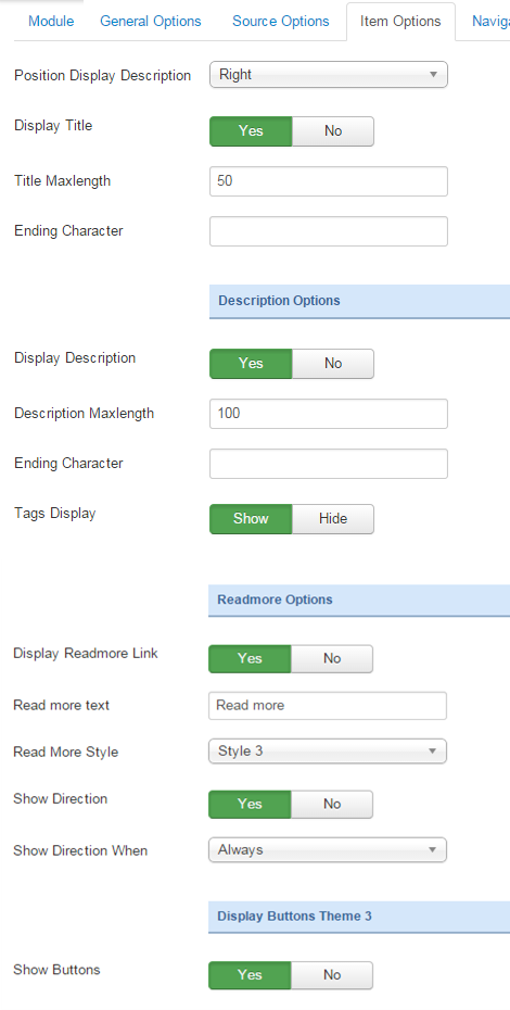
Item Options
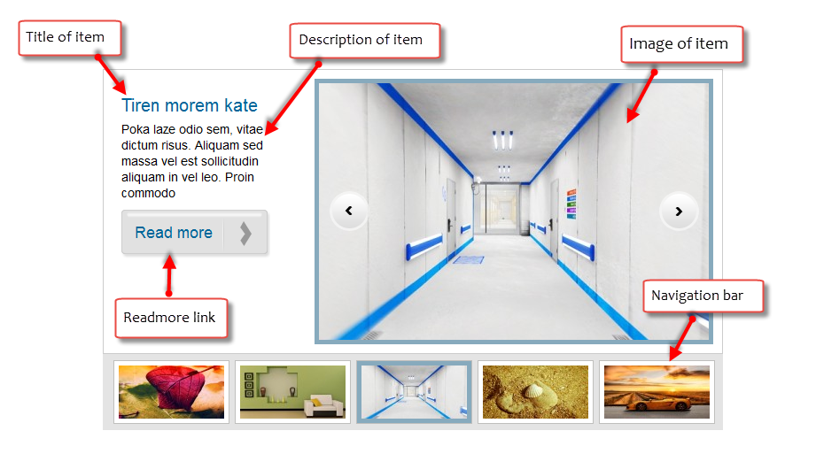
- Position Display Description – Allow to show description at right or left position of module
- Display Title – Allow to display title OR not
- Title Maxlength – The maxlength of title category. Set “0” to show full title
- Ending Character – Ending character when using the truncating the description
- Tags Display – Allow to show/hide tags of item
- Display Description -Allow to display description OR NOT
- Description Maxlength – The max length of description can be showed
- Display Readmore Link – Allow to show/hide link for readmore
- Read more text – Allow to insert the text for readmore link
- Read more style – Allow to select the style of readmore text. We support 4 style
-
- Show Direction – Allow to show/hide the direction
- Show Direction when – Allow to show navigation button when hover or always
- Show buttons – Allow to show/hide the buttons
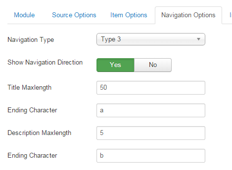
Navigation Options
- Navigation Type – You can choose one of Navigation Type, we support navigation type
- Show Navigation direction – Allow to show/hide navigation direction
- Title Maxlength -Max length of navigation title by character. Enter value 0 if you want to show all. Please enter integer number>=0
- Ending character – Ending character when using the truncating the title
- Description Maxlength -Max length of navigation description by character. Enter value 0 if you want to show all. Please enter integer number>=0
- Ending character – Ending character when using the truncating the description
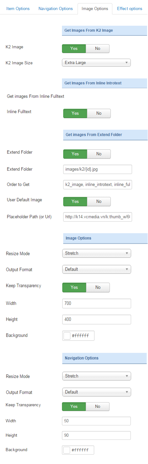
Image Options
- Get images from extend folder
- Extend Folder – Allow to show/hide Extend Folder
- Extend Folder – Set path to external image folder used by option above
- Order to Get – Order to Get image
- User Default Image – Allow to show/hide image
- Place holder Path (or Url)t -The path or URL of Default Image
- Images from Inline Introtext
- Inline Introtext – allow to show/hide image of item
- Get images from K2 Imager
- K2 Image – Allow to show/hide image initem of component k2
- K2 Image Size – Allow to choose image size in combobox
- Image options
- Resize Mode – Allow you to choose the mode of image resizing
- None
- Center
- Fill
- Fit
- Strech
- Output Format – Allow to set format for all output file:
- Default – if you want to keep original format
- GIF
- JPEG
- PNG
- Width – Allow to set the width of the image
- Height – Allow to set the height of the image
- Background – Allow to set the color of image background
- Navigation options
- Resize Mode – Allow you to choose the mode of image resizing
- None
- Center
- Fill
- Fit
- Strech
- Output Format – Output Format after resizing
- Width -Allow to set width of thumbnail
- Height – Allow to set height of thumbnail.
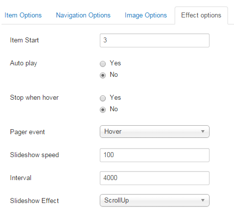
Effect Options
- Item start – The item which you want to show it at the first time. The value is from 1 to the total of item
- Auto Play – Allow you set for slideshow auto play OR not
- Stop when hover – Allow slideshow effect stop when hover OR NOT
- Pager event – Allow slideshow effect when hover OR click
- Slideshow speed -The time to move to next item
- Interval – Set to true to enable interval gesture support for advancing the slideshow forward or back
- Slideshow effect – Allow to select the style of slideshow effect
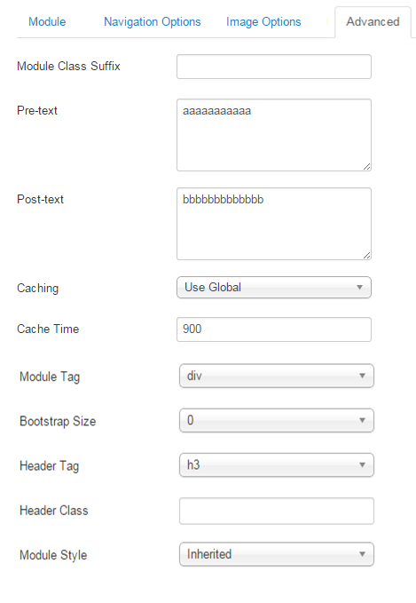
Advanced Options
- Module Class Suffix – Allow you to choose another CSS class that suits your template
- Pre-text – The content to show at the top of module
- Post-text – The content to show at the end of module
- Caching
- Use Global: Turn on caching
- No Caching: Turn off caching
- Cache Times – The time to cache
- Module Tag – Allow to select the HTML Tag for module
- Bootstrap Size – Allow to set the number of columns that module will use.
- Header Tag – Allow to select the HTML Tag for module header/title
- Header Class – Support the CSS Class for module header/title
- Module Style – Select module style
Thank you so much for purchasing this module. If you have any questions that are beyond the scope of this help file, please send us via: Submit a Ticket
Thanks so much!