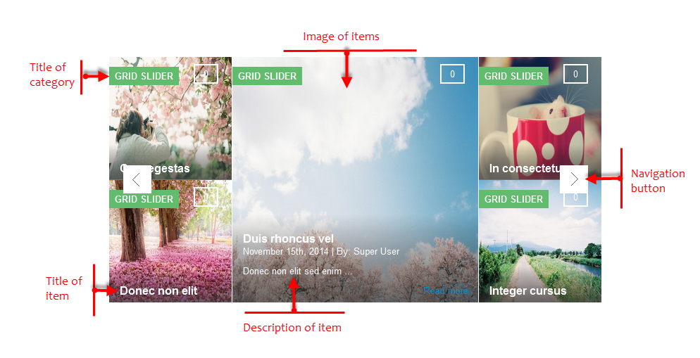
3.1 Below is module layout
3.2 Module Configuration
Note:We used the images of module’s installation on Joomla 3.x to illustrate
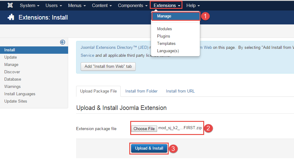
After installing, go to Extension -> Module Manager and find SJ Grid Slider for K2 to configure.
SJ Grid Slider for K2 module is configured in 6 main groups of parameters as following:
- Basic Options
- Source Options
- Item Options
- Image Options
- Effect Options
- Advanced Options
Let’s look at the parameters in detail:
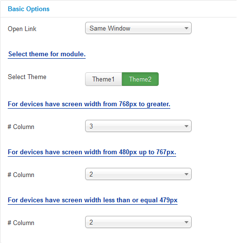
Basic Options
- Open Link – Allow to set target for links:
- New Window
- Same Window
- Popup Window
- Select theme for module
- Select Theme – Select Theme – Allow to select theme for the module.
- #Column – Allow to set the number of column for each screen resolution.
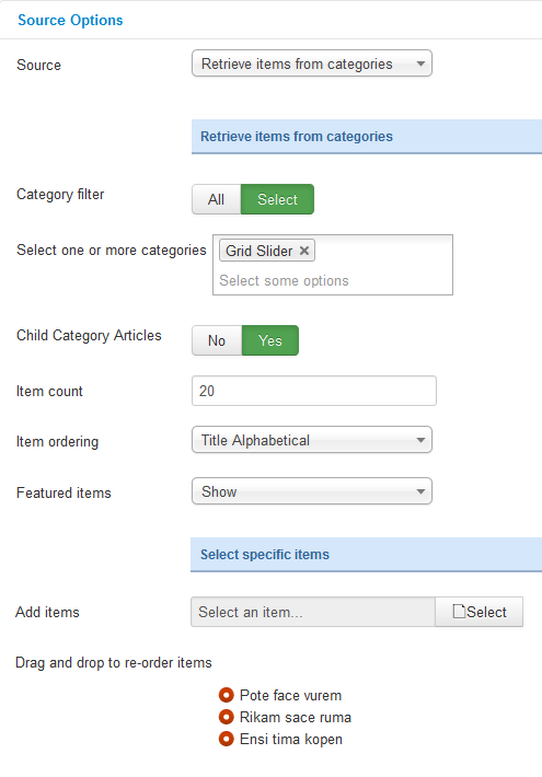
Source Options
- Source – Allow to choose one of two
- Retrieve items from category.
- Select specific items.
- If you choose : Retrieve items from category, you need to fill params below:
- Category filter – : allow to select one or all category in component.
- Select one or more categories – Choose the category which you want to show in this module.
- Child Category Articles – Allow to choose children categories OR not.
- Item count – Allow to select the number of items to display. Set “0” to display all items.
- Item Ordering – Allow to sort order by Title Alphabetical, ect.
- Featured item – Allow to show/hide or show only featured item.
- If you choose : Select specific items, you need to fill params below:
- Add item – Add item – Allow to choose items from item list in K2 component.
- Drag and drop to re-oder item – Allow to drag and drop to re-oder item.
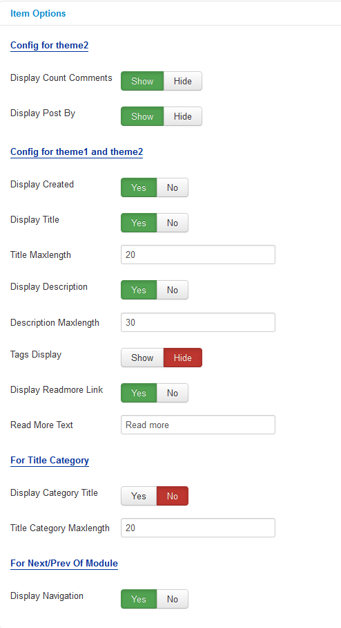
Item Options
- Config for theme2
- Display Counts Comments – Allow to show the number of K2 comment or Not.
- Display Post by – Allow to show the author of items.
- Config for theme1 and theme2
- Display Created – Allow to display created date of item OR not.
- Display Title – Allow to display title of item OR not.
- Title Maxlength – The maxlength of item’s title. Set “0” to show full title.
- Display Description – Allow to display description of item OR not.
- Description Maxlength – The max length of item’s description can be showed.
- Tags Display – Allow to show/hide item’s tags OR not.
- Display Readmore Link – Allow to show/hide link for readmore.
- Read More Text – Allow to insert the text for readmore link.
- For Title Category
- Display Category Title – Allow to display category title in item’s image OR not.
- Title Category Maxlength – Allow to set the maxlength for category title .
- For Next/Prev Of Module
- Display Navigation – Allow to display navigation button OR not.
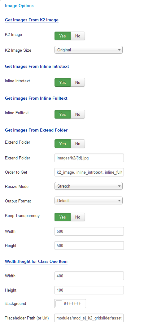
Image Options
- Get images from K2 Image.
- K2 Image – Allow get image from K2 component or Not..
- K2 Image Size – Allow to choose image size in combobox.
- Images from Inline Introtext
- Inline Introtext – Allow to show/hide image of item.
- Images from Inline Fulltext
- Inline Fulltext – Allow to show/hide image of item.
- Get images from extend folder
- Extend Folder – Allow to show/hide Extend Folder.
- Extend Folder – Set path to external image folder used by option above.
- Order to Get – Order to Get image.
- Resize Mode – Allow to choose the mode of image resizing.
- Keep Transparency – Allow to keep transparency of image OR not.
- Width – Allow to set width of image.
- Height – Allow to set height of image.
- Width, Height for Class One Item
- Width – Allow to set width of image for class one item.
- Height – Allow to set height of image for class one item.
- Background – Allow to set the color of image background.
- Place holder Path (or Url) -The path or URL of Default Image.
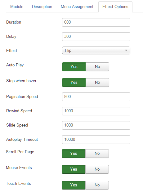
Effect Options
- Duration – Allow to set how long animation will run (Lager = Slower).
- Delay – Allow to set a timer to delay the excution of the next item in the queue (Lager = Slower).
- Effect – Allow to select effect of slider in this listbox.
- Auto Play – Allow to set for slider auto play OR not.
- Stop when hover – Allow slider effect stop when hover OR not.
- Pagination Speed – Allow to set pagination speed of slider with unit of milisecond.
- Rewind Speed – Allow to set rewind speed of slider with unit of milisecond.
- Slide Speed – Allow to set slide speed of slider with unit of milisecond.
- Autoplay Timeout – Allow to set Autoplay Timeout speed in milisecond.
- Scroll Per Page – Allow to run scroll per page OR not. This affect navigation button and mouse/touch draggeing.
- Mouse Events – Allow to run mouse events of slide OR not.
- Touch Events – Allow to run touch events of slide OR not.
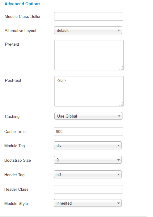
Advanced Options
- Module Class Suffix – Allow you to choose another CSS class that suits your template.
- Alternative Layout – Set custom layout for this module
- Pre-text – The content to show at the top of module.
- Post-text – The content to show at the end of module.
- Caching
- Use Global – Turn on caching
- No Caching – Turn off caching
- Cache Times – The time to cache
- Module Tag – Allow to select the HTML Tag for module.
- Bootstrap Size – Allow to set the number of columns that module will use.
- Header Tag – Allow to select the HTML Tag for module header/title.
- Header Class – Support the CSS Class for module header/title.
- Module Style – Select module style.
Thank you so much for purchasing this module. If you have any questions that are beyond the scope of this help file, please send us via: Submit a Ticket
Thanks so much!