3.1 Below is module layout
3.2 Module Configuration
Note:We used the images of module’s installation on Joomla 3.x to illustrate
After installing, go to Extensions -> Module Manager and find SJ Image Slider to configure
SJ Image Slider module is configured in 7 main groups of parameters as following:
- Basic Options
- Source Options
- Product Options
- Image Options
- Effect Options
- Advanced Options
Let’s look at the parameters in detail:
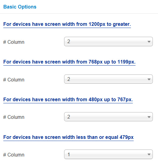
Basic Options
- # Column – Allow to set number of column for each device:
- For devices have screen width from 1200px to greater.
- For devices have screen width from 768px up to 1199px.
- For devices have screen width from 480px up to 767px.
- For devices have screen width less than or equal 479px
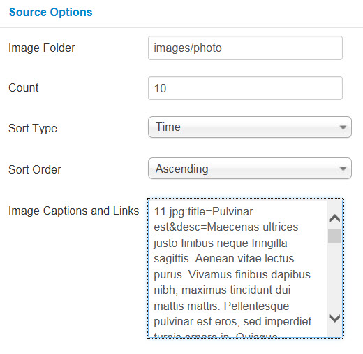
Source Options
- Image Folder – Allow to get image from image folder (e.x: You create a image folder in Joomla installation directory which has contained image, it will get all image from image folder to display )
- Count – Allow to set the number images to display. Enter “0” value to display all images. “20” is maximum
- Sort Type – Allow to sort type: “Time/Name”
- Sort Order – Allow to select ordering direction
- Image Captions and Links – Allow to input image captions and links (e.x: “[Image_Name].jpg:title=[Title_Name]&desc=[Des_Name]&link=[URL]=”).
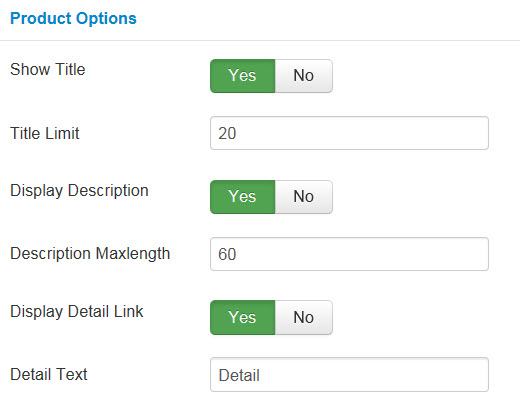
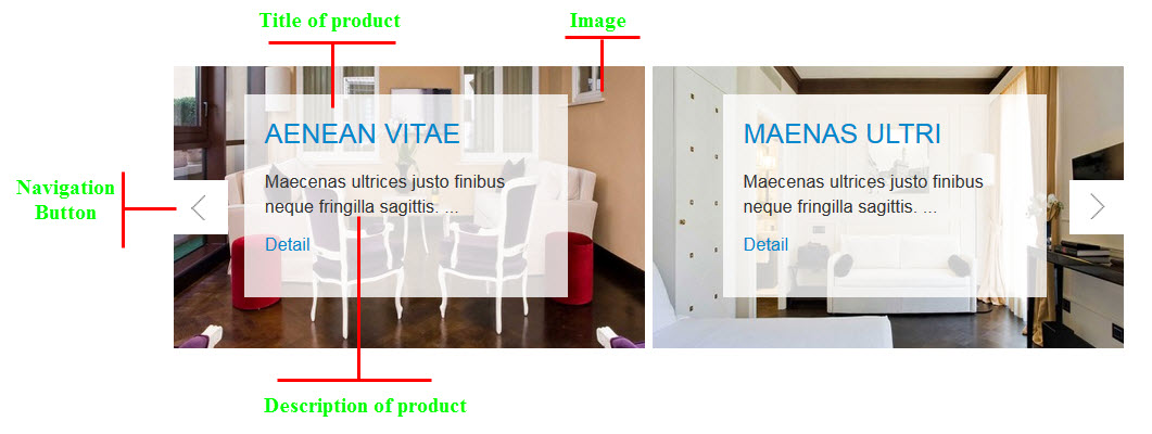
Product Options
- Show Title – Allow to show title OR not
- Title Limit – Allow to input the limitation of title
- Display Description – Allow to display description OR not
- Description Maxlength – Allow you to set the maxlength of description
- Display Detail Link – Allow you to display Detail link OR not
- Detail Text – Allow you to input Detail text
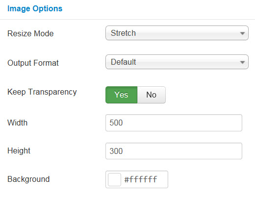
Image Options
- Resize Mode – Allow you to choose the mode of image resizing
- None
- Center
- Fill
- Fit
- Strech
- Output Format – Allow to set format for all output file:
- Default – if you want to keep original format
- GIF
- JPEG
- PNG
- Keep Transparency – Allow to keep images transparent, for PNG and GIF format
- Width/Height – Allow you to set the width/height of the big image
- Background – Allow to set the color of image background. This is applied for showing images without full background. If the image with full background, you can see nothing to change
Small Image Options
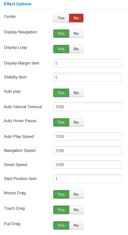
Effect Options
- Center – Allow to set subcategory at “center” OR not
- Display Navigation – Allow to display navigation OR not
- Display Loop – Allow to display loop OR not
- Display Margin Item – Allow to set Margin Item
- SlideBy Item – Allow to set the number of item slideby
- Auto play – Allow to Enable/Disable autoplay mode
- Auto Interval Timeout – Allow to set the speed of timer. Larger = Slower
- Auto Hover Pause – Allow to pause effect when user hover
- Auto Play Speed – Allow to set speed of auto play
- Navigation Speed – Allow to set speed of navigation
- Smart Speed – Allow to set speed on smart devices: iphone, ipad…
- Start Position Item – Allow to set the value of item which will be start position
- Mouse Drag – Allow to Enable/Disable the mouse drag OR not
- Touch Drag – Allow to set the touch drag on the smart devices OR not
- Pull Drag – Allow to set the pull drag on the smart devices OR not
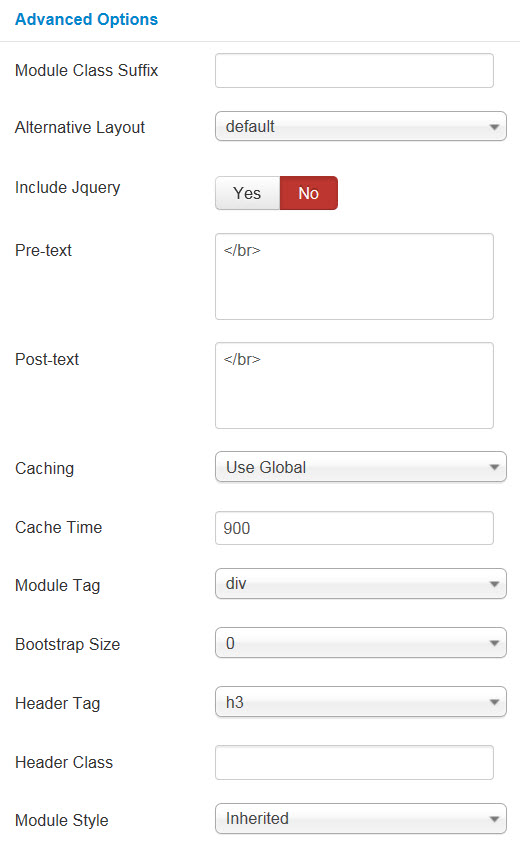
Advanced Options
- Module Class Suffix – A suffix to be applied to the CSS class of the module. This allows for individual module styling.
- Alternative Layout – Set custom layout for this module
- Include Jquery – Allow you to include Jquery OR NOT
- Pre-text – The content to show at the top of module
- Post-text – The content to show at the end of module
- Caching
- Use Global: Turn on caching
- No Caching: Turn off caching
- Cache Times – The time to cache
- Module Tag – Allow to select the HTML Tag for module
- Bootstrap Size – Allow to set the number of columns that module will use.
- Header Tag – Allow to select the HTML Tag for module header/title
- Header Class – Support the CSS Class for module header/title
- Module Style – Select module style