First of all, make sure you always download the newest version. When you buy the module, you already have the last version.
The following documentation is applied for packages from version 1.0 of SJ Content Mega Slider, SJ K2 Mega Slider and SJ VM Mega Slider Joomla extensions.
REQUIREMENTS
– Joomla! 3.x latest stable versions are highly recommended.
INSTALLATION
1. Please to refer the installation in administrator of module on Joomla! 3.x after:
- In Administrator page, go to Extensions -> Install/Uninstall
In this page, click on Browse.. button, choose our module and then click Upload File & Install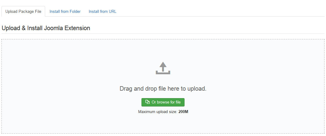
- Go to Extensions -> Module Manager, click Select Type box and choose the module you have installed
- Then click the module listed below to configure it as SETTINGS part hereafter
2. And now, please to preview module with layout of Sj Mega Slider for Content for example:
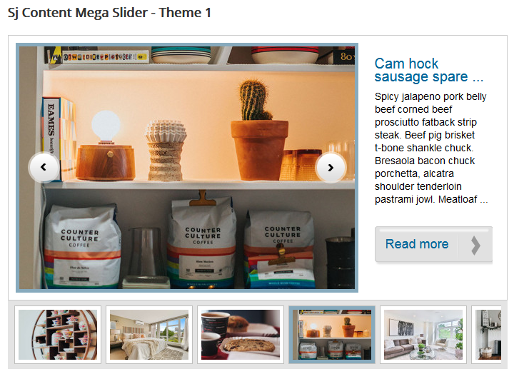
- Large/Small Image: This is the first image in the description of Article
- Main/Normal Description: This is the intro text in the description of Article
SETTINGS
Let’s examine all the settings detail on Sj Content Mega Slider
The parameters are divided into the following areas:
- Module Settings
- Source Options
- Items Options
- Navigation Options
- Image Option
- Effect Options
- Advanced Options
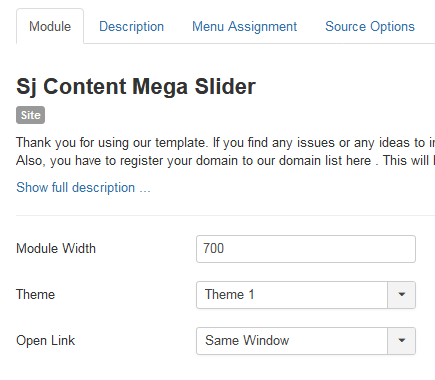
MODULE SETTINGS
- Module Width– Allow to set width of module
- Theme– Allow you to select themes available
- Open link – The opening window with link:
- Same window
- New window
- Popup window
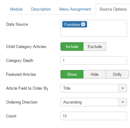
SOURCE OPTIONS
- Data Source – Choose categories that you want to show in this module
- Child Category Articles – Allow you showing items in subcategories if you choose Yes
- Category Depth: Set the category depth
- For Featured Articles – Allow you to filter articles with 3 options:
- Show: Show all articles
- Show only: Show featured articles only
- Hide: Hide articles which are featured articles
- Articles Field to Order By – Allow you to sort order articles by
- Ordering Direction – Order the item
- Count – The number of items to show
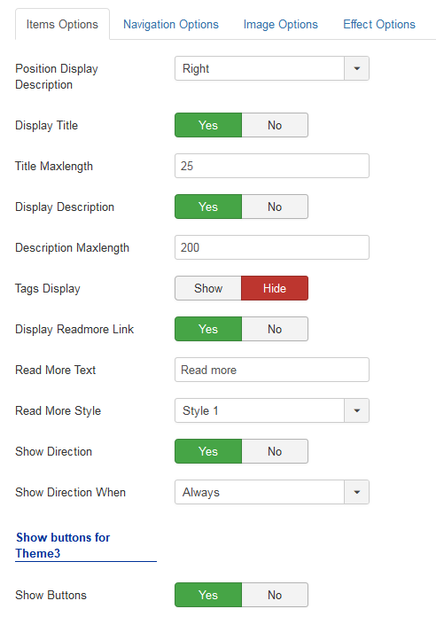
ITEM OPTIONS
- Position Display Description – Allow to set position of description:
- Display Title – Show/hide the title of article
- Title Maxlength – Allow to set the number of characters in title. Choosing 0 if you want to show full title.
- Display Description – Show/hide description of article
- Description Maxlength – Allow to set the number of characters in the description. Choosing 0 if you want to show full title.
- Tags Display – Show or Hide tags
- Display Read More – Show/hide Read More
- Read More Text – Allow you to alter the text for Read more..
- Read More Style – Allow to choose one of four Readmore styles available
- Show Direction – Show/hide Direction
- Show Direction When – Support 2 directions: Click and Hover
Show buttons for Theme 3
- Show Buttons – Show/hide previous button and next button
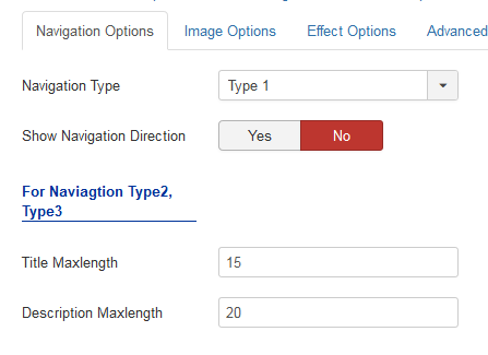
NAVIGATION OPTIONS
- Navigation Type – Allow to select type of navigation
- Show Navigation Direction – Show/hide navigation direction
For Navigation Type 2, Type 3
- Title Maxlength – Allow to set the max number of characters in title. Choosing 0 if you want to show full title.
- Description Maxlength – Allow to set the max number of characters in description. Choosing 0 if you want to show full description.
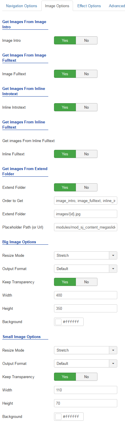
IMAGE OPTIONS
- Allow to get Images from Intro, Full Text, Intro Text, Inline Full Text or Extended Folder
- Resize Mode for small & big images:
- Out Format: Default, GIF, JPG, PNG
- Keep transparent: Yes or No
- Image Width/Height – You can change width/height for image
- Background: set the background color
- Placeholder Patch: Set the placeholder path
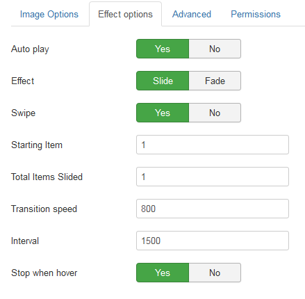
EFFECT OPTIONS
- Item Start – Allow you set item which you want to show at the first time
- Auto Play – Allow you to set autoplay for slideshow
- Stop when Hover – Allow you to stop slide when being hovered OR not
- Pager event – We support two events: Click and Hover
- Slideshow speed – Allow to set the speed to run slider
- Interval – Allow to set the duration to move to next product
- Slideshow Effect – Support 25 effects for your module
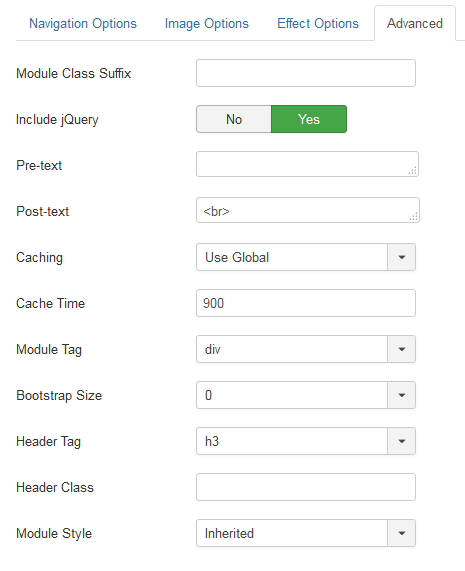
ADVANCED
-
- Module Class Suffix – Allow to set Class Suffix for module
- Layout – Allow you to choose another layout available
- nclude Jquery – Allow you to include Jquery OR NOT.
- Pre-text – The content to show at the top of module.
- Post-text – The content to show at the end of module.
- Caching
- Use Global: Turn on caching
- No Caching: Turn off caching
- Cache Times – The time to cache
- Module Tag – Allow to select the HTML Tag for module.
- Bootstrap Size – Allow to set the number of columns that module will use.
- Header Tag – Allow to select the HTML Tag for module header/title.
- Header Class – Support the CSS Class for module header/title.
- Module Style – Select module style.