This guide will help you install SO Extra Slider – Version 1.0.1 step by step.
1REQUIREMENT – Back to top
At the basic level, this module will require the following conditions:
- Compatible with version OpenCart: OpenCart 2.x
- Have responsive
2INSTALLATION – Back to top
Prepare your module package
- Firstly, you need to UNZIP file that you have downloaded .
- Secondly, copy file that you have unzipped and paste into htdoc/open_cart
- In your Administrator page, go to Extensions -> Modules. In this page, choose module “SO Extra Slider”, click Install button
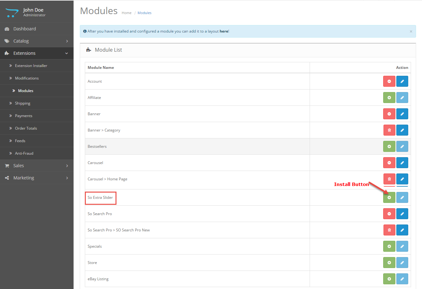
- Please wait for module being installed, usually within several seconds
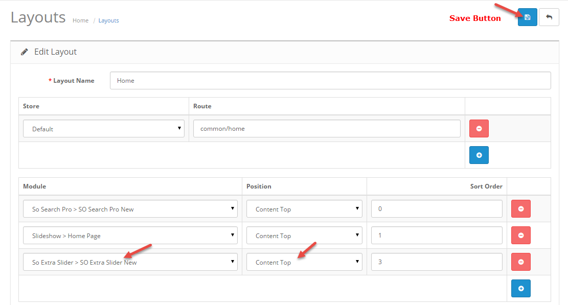
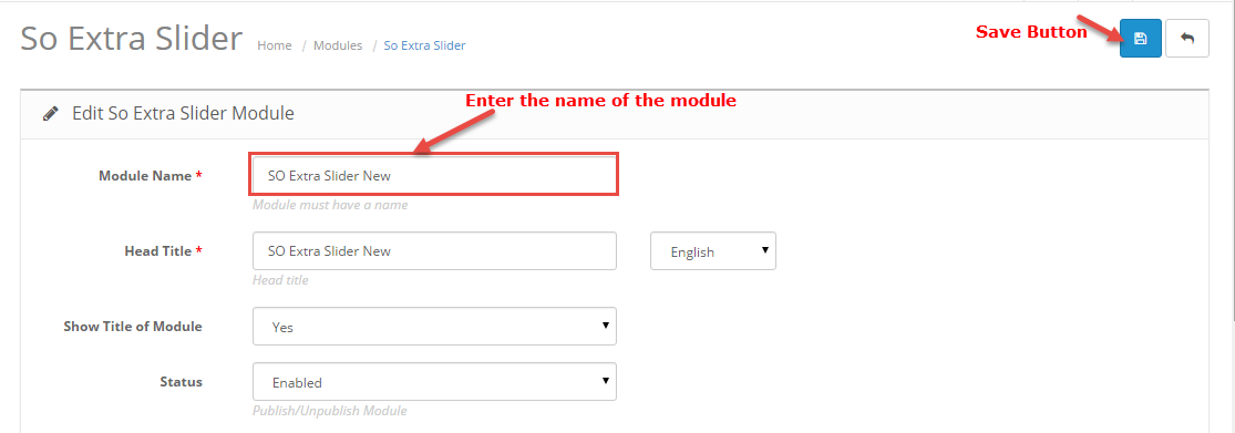
- To Create the name of this module, please go to Extensions >> Modules >> Choose module “SO Extra Slider” >> Click “Edit” button
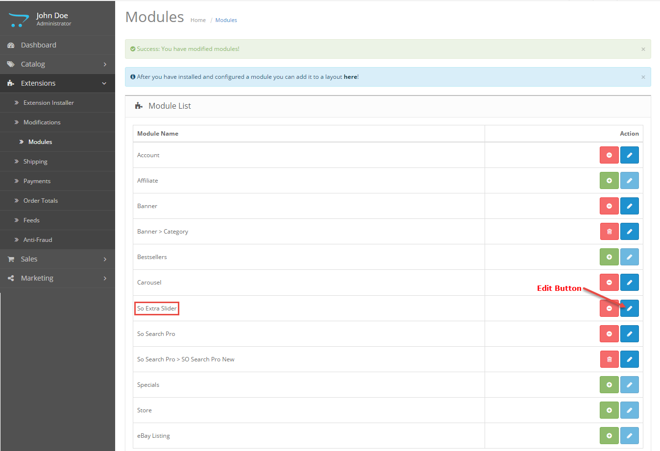
- Enter the name of the Module and fill the fields in the tabs. Then click “Save” button
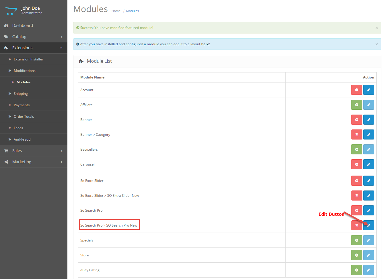
- To configure this module, please go to Extensions >> Modules >> Choose the module you have Created >> Click “Edit” button
3MODULE CONFIGURATION – Back to top
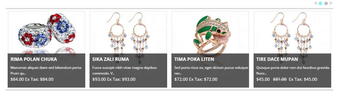
3.1 Module Demo
3.2 Module Configuration
SO Extra Slider are configured in 6 groups of parameters following:
- General Options
- Source Options
- Products Options
- Image Options
- Effect Options
- Advanced
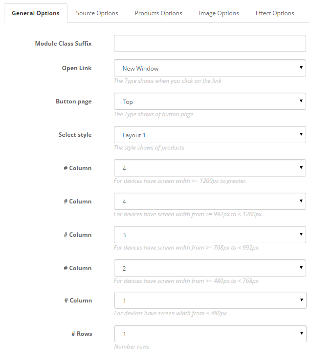
General Options.
- Module Class Suffix – Allow to input class suffix.
- Open Link – Allow to set target for links:
- Button Page – Allow to choose type of Button Page: Top/Under
- # Column – Allow to set number of column for each device:
- For devices have screen width from 1200px to greater.
- For devices have screen width from 992px up to 1200px.
- For devices have screen width from 768px up to 992px.
- For devices have screen width from 480px up to 768px.
- For devices have screen width less than or equal 480px.
- Rows – Allow to enter Number rows
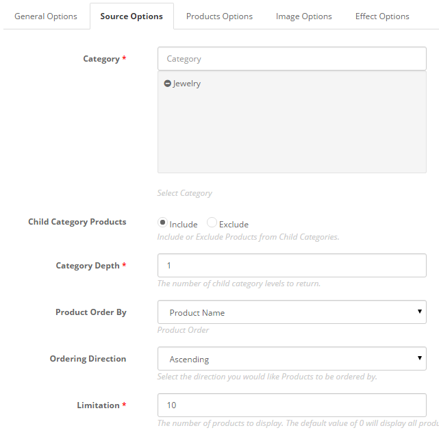
Source Options.
- Category – Allow to choose categories which you want to show.
- Child Category Products – Allow to include or exclude products from child categories.
- Category Depth – The number of child category levels to return.
- Product Order By – Allow to choose 1 of 7: Name/Model/Price/Quantity/Rating/Sort Order/Date Add.
- Ordering Direction – Allow to select ordering direction: Ascending/Descending.
- Limitation – Maximum number of products to display. Enter “0″ for unlimited.
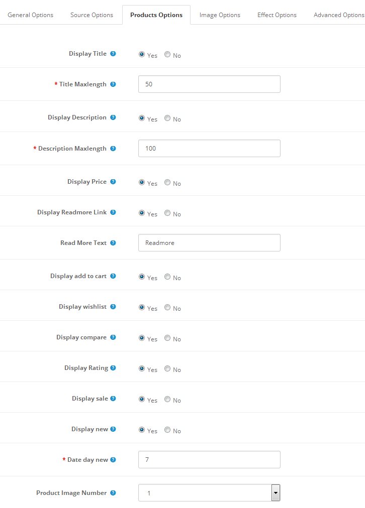
Products Options.
- Display Title – Allow to display title of item OR not.
- Title Maxlength – The maxlength of item’s title. Set “0” to show full title.
- Display Description – Allow to display description of item OR not.
- Description Maxlength – The max length of item’s description can be showed.
- Display Price – Allow to display Price OR not..
- Display Readmore Link – Allow to show/hide link for Read More.
- Readmore Text – Allow to insert the text for readmore link..
- Display add to cart – Allow to display add to cart or not.
- Display Wishlish – Allow to display wishlish or not.
- Display Compare – Allow to display Compare or not.
- Display Rating – Allow to show/hide Rating.
- Display Sale – Allow to show/hide image Sale.
- Display New – Allow to display image New or not.
- Dateday New – Allow to enter number day of product new.
- Product Image Number – Allow to show number image for product.
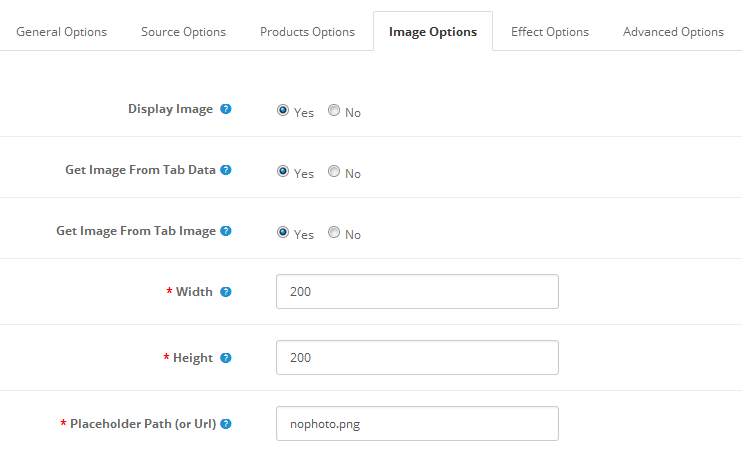
Image Options.
- Display Image – Allow to show/hide Product Image.
- Get Image From Tab Data – Allow to Get Image From Tab Data or not.
- Get Image From Tab Image – Allow to Get Image From Tab image.
- Width – Allow to set width of image.
- Height – Allow to set height of image.
- Placeholder Path (or Url) – The path(or URL) of default image.
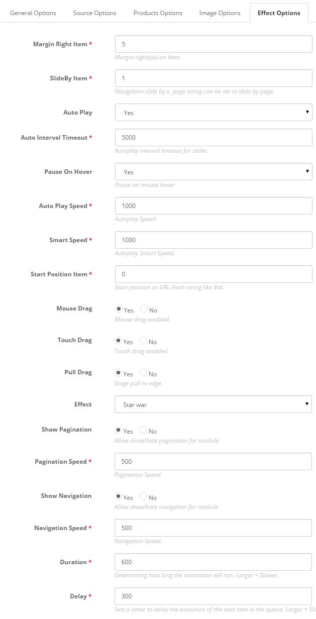
Effect Options
- Margin Right Item – Allow to enter Margin-right (px) on Item
- SlideBy Item – Navigation slide by x. page string can be set to slide by page.).
- Auto Play – Allow you set for slideshow auto play OR not.
- Auto Interval Timeout – Autoplay interval timeout for slider.
- Pause On Hover – Allow slideshow effect stop when hover OR Not.
- Auto Play Speed – Allow to set speed of timer (larger = slower).
- Smart Speed – Allow to set Smart speed of auto play.
- Start Position Item – Allow to Start position or URL Hash string like #id.
- Mouse Drag – Allow to Enable/Disable Mouse Drag.
- Touch Drag – Allow to Enable/Disable Touch Drag.
- Pull Drag – Allow to set the pull drag on the smart devices OR not.
- Effect – Allow to choose type of effect.
- Show Pagination – Allow show/hide Pagination for module.
- Pagination Speed – Allow to set Pagination Speed.
- Show Navigation – Allow show/hide Navigation for module.
- Navigation Speed – Allow to set Navigation for module.
- Duration – Allow to set how long animation will run (Lager = Slower).
- Delay – Allow to set a timer to delay the excution of the next item in the queue (Lager = Slower).
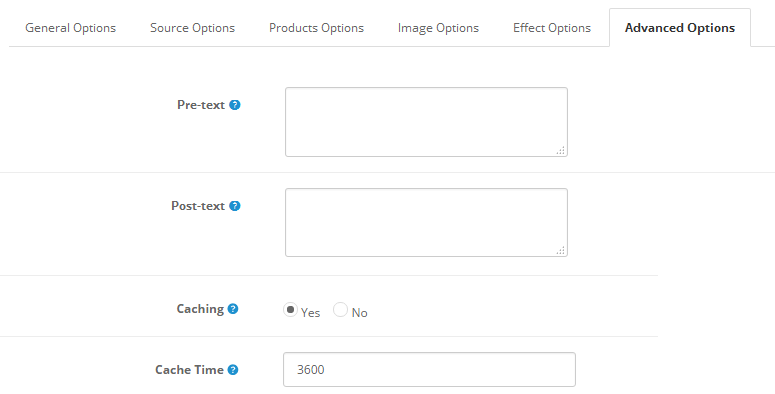
Advanced.
- Pre-text – Allow to enter intro text of the module.
- Post-text – Allow to enter footer text of the module.
- Caching – Select whether to cache the content of this module.
- Cache Time – The time in seconds before the module is recached.
4SUPPORT – Back to top
Thank you so much for purchasing this module. If you have any questions that are beyond the scope of this help file, please send us via: Submit a Ticket
Thanks so much!