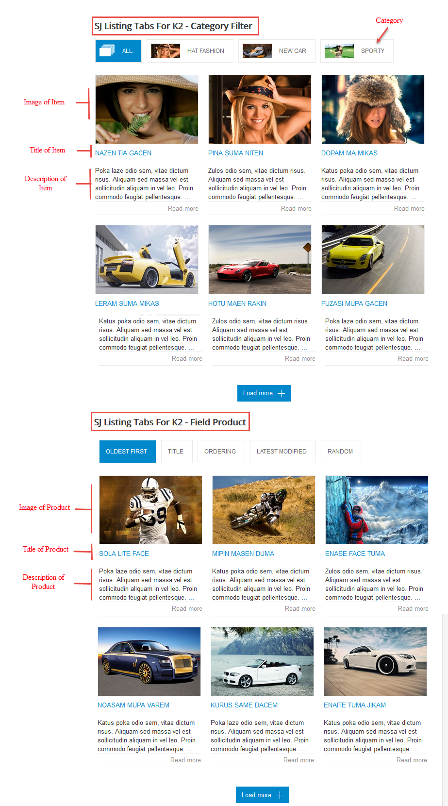
3.1 Module Demo
3.2 Module Configuration
Note:We used the images of module’s installation on Joomla 3.x to illustrate.
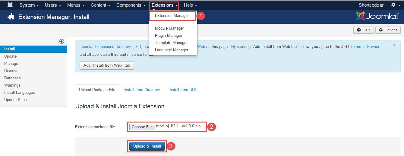
After installing, go to Extensions -> Module Manager and find SJ Listing Tabs For K2 to configure.
SJ Listing Tabs For K2 module is configured in 7 main groups of parameters as following:
- Basic Options.
- Source Options.
- Tabs Options.
- Item Options.
- Image Options.
- Effect Options.
- Advanced.
Let’s look at the parameters in detail:
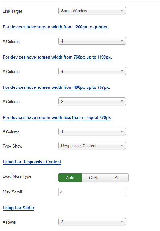
Basic Options.
- Link Target – Allow to choose one of three:
- Same window.
- New window.
- Popup window.
- # Column – Allow to set number of column for each device:
- For devices have screen width from 1200px to greater.
- For devices have screen width from 768px up to 1199px.
- For devices have screen width from 480px up to 767px.
- For devices have screen width less than or equal 479px.
- Type Show – Allow to choose one of three:
- Load more.
- Slider.
- Responsive Content.
Using For Responsive Content – Allow to choose one of three:
- Load More Type – you can choose one of three: Auto, Click, All.
- Max Scroll: allow to set the number of scrolls.
- Using For Slider
- Rows: allow to set number of rows for slider
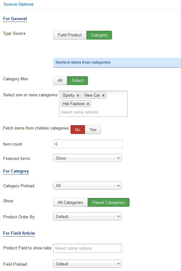
Source Options.
- For General
- Type Source – Allow to choose Type Source: Field Product/Category.
- If you choose : Retrieve items from category, you need to fill params below:
- Category filter – Allow to select one or all category in component..
- Select one or more categories – Choose the category which you want to show in this module.
- Fetch items from children categories – Allow to choose children categories OR not.
- Item count – Allow to select the number of items to display. Set “0″ to display all items.
- Featured items – Allow to choose 1 of 3
- Show.
- Hide.
- Show only Featured Items.
- For Category
- Category Preload – Allow to select Category Preload.
- Show – Allow to Show: All Categories/Parent Categories.
- Product Order By – Allow to sort order by Title Alphabetical, ect…
- For Field Article
- Product Field to show tabs – Allow to select some optons of Product Field .
- Field Preload – Allow to select type Field Preload.
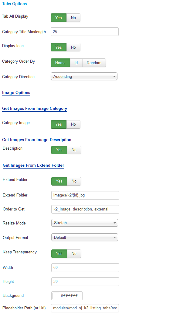
Tabs Options.
- Tab All Display – Allow to display Tab All Or Not.
- Category Title Maxlength – Max length of category title by characters. Enter value 0 if you want to show all. Please enter integer number >= 0..
- Display Icon – Allow to display Icon Or Not.
- Category Order By – Allow to choose 1 of 3: Name/Odering/Random.
- Category Direction – Allow to choose Category Direction: Ascending/Descending.
- Get Images From Image Category
- Category Image – Allow to show/hide Category Image.
- Get Images From Image Description
- Description – Allow to show/hide Description.
- Get Images From Extend Folder
- Extend Folder – Allow to show/hide Extend Folder.
- Extend Folder – Set path to external image folder used by option above.
- Order to Get – Order to Get image.
- Resize Mode – Allow to choose the mode of image resizing.
- Output Format – Output Format after resizing.
- Keep Transparency – Allow to keep transparency of image OR not.
- Width – Allow to set width of image.
- Height – Allow to set height of image.
- Background – Allow to set the color of image background.
- Place holder Path (or Url) – The path or URL of Default Image.
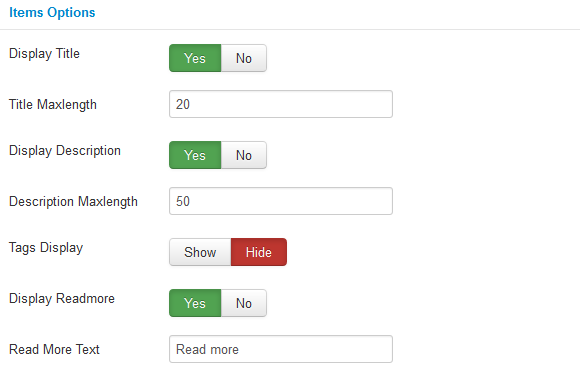
Items Options
- Display Title – Allow to display title of item OR not.
- Title Maxlength – The maxlength of item’s title. Set “0” to show full title.
- Display Description – Allow to display description of item OR not.
- Description Maxlength – The max length of item’s description can be showed.
- Tags Display – Allow to show/hide Tags of Item.
- Display Readmore – Allow to display Readmore Button Or Not.
- Read More Text – Allow to insert the text for readmore link.
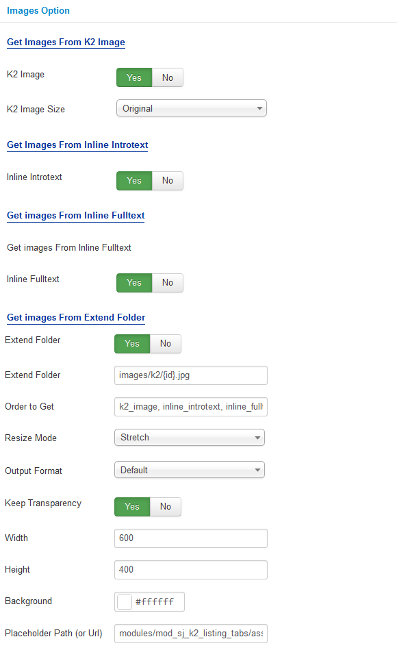
Image Options.
- Get Images From K2 Image
- K2 Image – Allow get image from K2 component or Not.
- K2 Image Size – Allow to choose image size in combobox.
- Get Images From Inline Introtext
- Inline Introtext – Allow to show/hide image of item.
- Get images From Inline Fulltex
- Inline Fulltext – Allow to show/hide image of item.
- Get Images From Extend Folder
- Extend Folder – Allow to show/hide Extend Folder.
- Extend Folder – Set path to external image folder used by option above.
- Order to Get – Order to Get image.
- Resize Mode – Allow to choose the mode of image resizing.
- Output Format – Output Format after resizing.
- Keep Transparency – Allow to keep transparency of image OR not.
- Width – Allow to set width of image.
- Height – Allow to set height of image.
- Background – Allow to set the color of image background.
- Place holder Path (or Url) – The path or URL of Default Image.
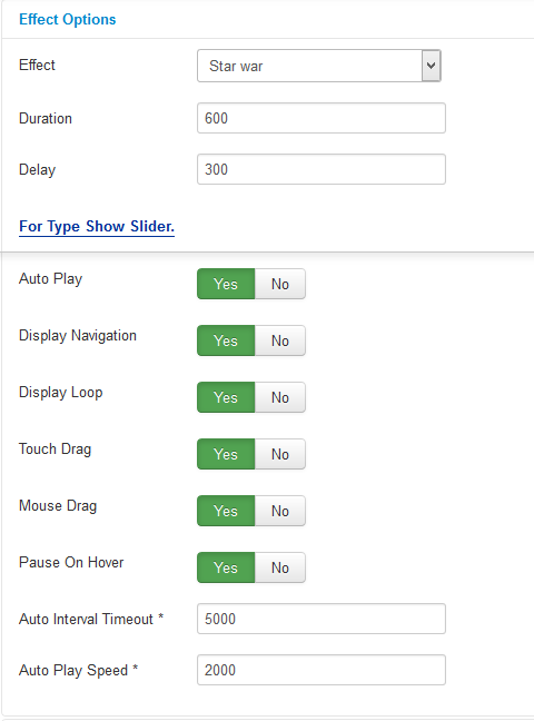
Effect Options
- Effect – Allow to select effect of slider in this listbox.
- Duration – Allow to set how long animation will run (Lager = Slower).
- Delay – Allow to set a timer to delay the excution of the next item in the queue (Lager = Slower).
- For Type Show Slider.
- Auto Play – Allow to Enable/Disable autoplay mode.
- Show Navigation – Allow show/hide Navigation for module.
- Display Loop – Allow to show/hide Loop for slider.
- Touch Drag – Allow to set the touch drag on the smart devices OR not.
- Mouse Drag – Allow to Enable/Disable the mouse drag OR not.
- Pause On Hover – Allow slideshow effect stop when hover OR NOT.
- Auto Interval Timeout – Allow to set the speed of timer. Larger = Slower.
- Auto Play Speed – Allow to set speed of auto play.
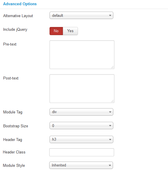
Advanced Options.
- Alternative Layout – Set custom layout for this module.
- Include Jquery – Allow you to include Jquery OR NOT.
- Pre-text – The content to show at the top of module.
- Post-texl – The content to show at the end of module.
- Module Tag – Allow to select the HTML Tag for module.
- Bootstrap Size – Allow to set the number of columns that module will use.
- Header Tag – Allow to select the HTML Tag for module header/title.
- Header Class – Support the CSS Class for module header/title.
- Module Style – Select module style.