This guide will help you install SJ Newsletter Popup step by step.
1REQUIREMENT – Back to top
At the basic level, this module will require the following conditions:
- Compatible with version Joomla: Joomla!2.5, Joomla! 3.x and Responsive layout.
2INSTALLATION – Back to top
Prepare your module package
- Firstly, you need to UNZIP file that you have downloaded. Please note that you should choose module package that are suitable with each Joomla version which you have just downloaded.
- Secondly, install main module (extracted mod_ file):
- In your Administrator page, go to Extensions -> Extension Manager. In this page, click “Choose file”, select module package.
- Then click Upload & Install
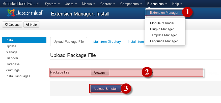
- Please wait for module being installed, usually within several seconds.
- Now go to Extensions -> Module Manager, click Select Type box and choose the module you have installed.
- Prepare to perform Module Configuration
3MODULE CONFIGURATION – Back to top
3.1 Module Demo

3.2 Module Configuration
NOTE: We used the images of module’s installation on Joomla 3.x to illustrate
After installing, go to
Extension -> Module Manager and find
SJ K2 Slider to configure
SJ K2 Slider module are configured in 6 groups of parameters following:
- Basic Options
- Source Options
- Item Options
- Image Options
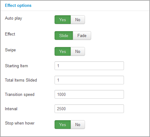
- Effect Options
- Advanced Options
Let’s look at the parameters in detail:
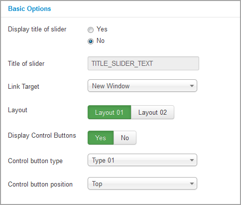
BASIC OPTIONS
- Display title of slider – Allow you to show/hide title of slider
- Title of slider – Allow you set title of slider
- Link Target – Allow to select open link in the Sample/New/ Popup window.
- Layout – Allow you to choose one of 2 layouts available
- Display Control Buttons – Allow to show/hide control buttons
- Control Button Type – Allow you to choose one of 3 control button types
- Control Button Position – Allow to choose control button positions to place navigation buttons:
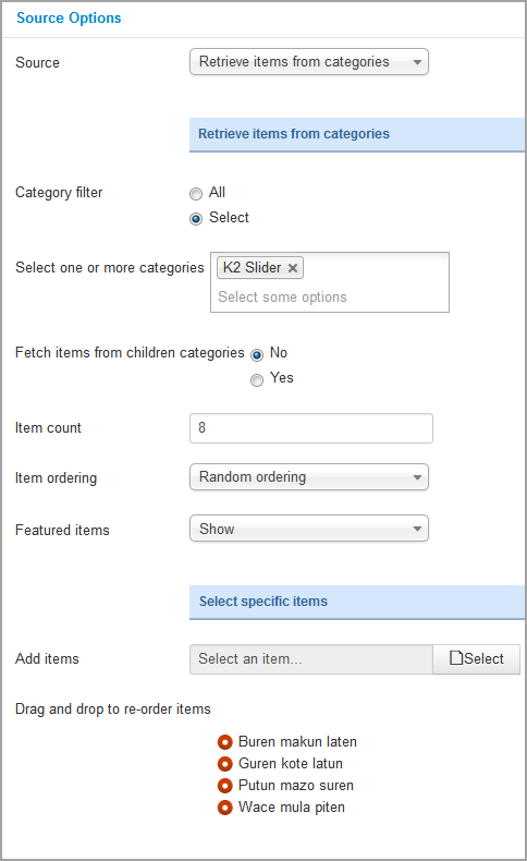
SOURCE OPTIONS
- Source – Allow to choose source to show item
- Retrieve items from categories
- Select specific items
Retrieve items from categories
- Category filter – Allow to choose all or only selected categories
- Select one or more categories – If above choice is “select”, you must to select categories that are used in this module
- Fetch items from children categories – Allow to get data from child categories or not
- Item count – Allow to set number of articles which will be displayed in the module. Set value “0” if you want to display all articles.
- Item ordering – Select the item ordering way:
- Oldest first (by date created)
- Most recent first (by date created)
- Most recent first (by date published)
- Title Alphabetical
- Title Reverse-Alphabetical
- Ordering
- Ordering reverse
- Most popular
- Highest rated
- Most recommented
- Latest modified
- Random Ordering
- Featured Items – Allow to show/hide/show only featured items
Select specific items
- Add items – Allow to select specific item to be shown
- Drag and drop to re-order item – Allow to drag and drop to re-order items that you selected in “Add items” param. It also allows to remove item by click the remove icon
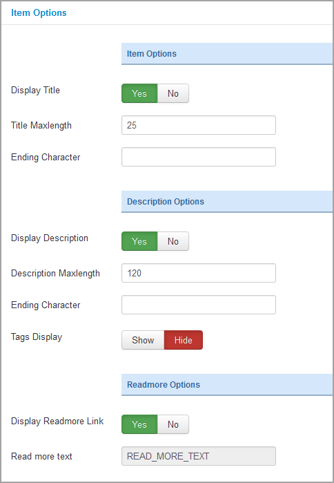
ITEM OPTIONS
Item Options
- Display Title – Allow to show title OR not
- Title Maxlength – Allow to set the length of category title, set 0 for showing full title
- Ending character – Set ending character of title when using the truncating the title
Description Options
- Display Description – Allow to show category description OR not
- Description Maxlength – Allow to set the length of category description, set 0 for showing full description
- Ending character – Set ending character when using the truncating the description
- Tags Display – Allow to display tags for each article OR not
Readmorre Options
- Display Readmore Link – Allow to show Readmore link OR not
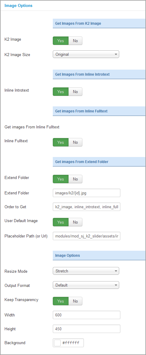
IMAGE OPTIONS
Note: Image sources will be got in the item – Click HERE
Get Image From K2 Image
- K2 Image – Allow you to get image from K2 image tab OR not
- K2 Image size – Set size for k2 image tab
Get Image From Inline Introtext
- Inline Introtext – Allow you to get image from Introtext OR not
Get Image From Inline Fulltext
- Inline Fulltext – Allow to get image from Fulltext OR not
Get Image From Extend Folder
- Extend Folder – Allow to extend folder or not
- External Folder – Set path to external image folder used by option above
- Order to Get – Set order: k2_image, inline_introtext, inline_fulltext, external OR external, inline_fulltext, inline_introtext, k2_image
- Use Default Image – Allow you to use a placeholder image when entries’ image is empty
- Placeholder Path or Url – Allow to set path to placeholder image
Big Image Options
- Resize Mode – Allow you to choose the mode of image resizing
- None
- Center
- Fill
- Fit
- Strech
- Output Format – Allow to set format for all output file:
- Default – if you want to keep original format
- GIF
- JPEG
- PNG
- Keep Transparency – Allow to keep images transparent, for PNG and GIF format
- Width/Height – Allow to set width/height of image
- Background – Allow to set the color of big image background.This is applied for showing images without full background. If the image with full background, you can see nothing to change.
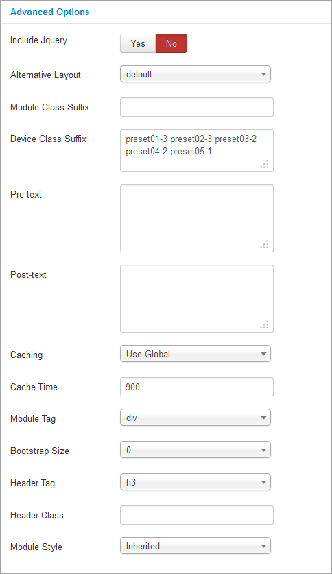
ADVANCED OPTIONS
- Include jQuery – Allow you to include jQuery from this module or another one
- Alternative Layout – Allow to use a different layout from the supplied module or overrides in the templates
- Module Class Suffix – Allow you to style module with specific CSS suffix
- Device Class Suffix – Allow you to choose CSS classes that suit devices you want
- Pre-text – The content to show at the top of module
- Post-text – The content to show at the end of module
- Caching
- Use Global: Turn on caching
- No Caching: Turn off caching
- Cache Times – The time to cache
- Module Tag – Allow to select the HTML Tag for module
- Bootstrap Size – Allow to set the number of columns that module will use.
- Header Tag – Allow to select the HTML Tag for module header/title
- Header Class – Support the CSS Class for module header/title
- Module Style – Select module style
4SUPPORT – Back to top
Thank you so much for purchasing this extension. If you have any questions that are beyond the scope of this help file, please send us via: Submit a Ticket
Thanks so much!