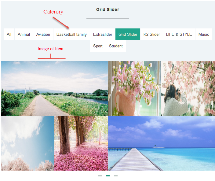
3.1 Module Demo
3.2 Module Configuration
Note:We used the images of module’s installation on Joomla 3.x to illustrate.
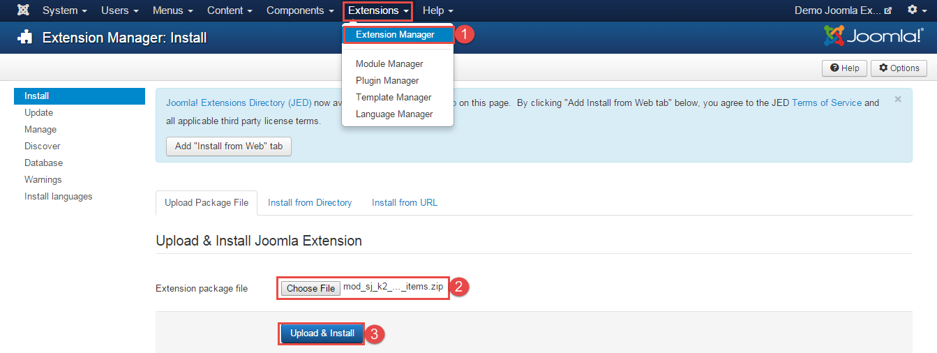
After installing, go to Extensions -> Module Manager and find SJ Highlight Items For K2 to configure.
SJ Highlight Items For K2 module is configured in 7 main groups of parameters as following:
- Basic Options.
- Source Options.
- Item Options.
- Tabs Options.
- Image Options.
- Effect Options.
- Advanced.
Let’s look at the parameters in detail:
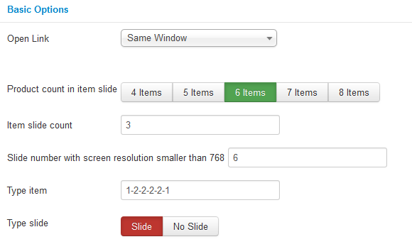
Basic Options.
- Open Link – Allow to choose one of three:
- Same window.
- New window.
- Popup window.
- Product count in item slide – Allow to choose product count in item slide.
- Item slide count – Allow to enter the number of items to display.
- Slide number with screen resolution smaller than 768 – Allow to enter the number of Slide with screen resolution smaller than 768.
- Type Item – Allow to enter Type item (the number of items selected above: 1: full-size image; 2: smaller image).
- Type slide – Allow to Slide/No Slide.
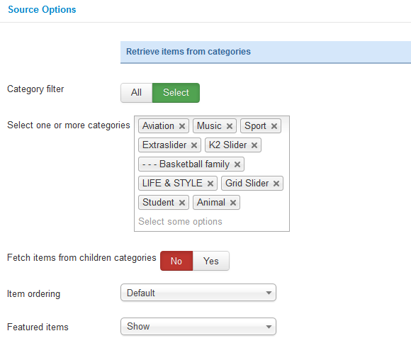
Source Options.
- Category filter – Allow to select one or all category in component.
- Select one or more categories – Choose the category which you want to show in this module.
- Fetch items from children categories – Allow to fetch items from children categories.
- Item ordering – Allow to sort order by Title Alphabetical, ect..
- Featured items – Allow to choose 1 of 3
- Show.
- Hide.
- Show only Featured Items.
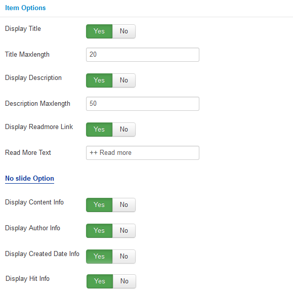
Items Options
- Display Title – Allow to display title of item OR not.
- Title Maxlength – The maxlength of item’s title. Set “0” to show full title.
- Display Description – Allow to display description of item OR not.
- Description Maxlength – The max length of item’s description can be showed.
- Display Readmore Link – Allow to show/hide link for Read More.
- Read More Text – Allow to insert the text for readmore link.
- Display Content Info – Allow to display Content Info Or Not.
- Display Author Info – Allow to display Author Info Or Not.
- Display Created Date Info – Allow to Display Created Date Info Or Not.
- Display Hit Info – Allow to Display Hit Info Or Not.
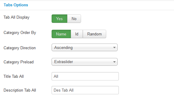
Tabs Options.
- Tab All Display – Allow to display Tab All Or Not.
- Category Order By – Allow to choose 1 of 3: Name/Odering/Random.
- Category Direction – Allow to choose Category Direction: Ascending/Descending.
- Category Preload – Allow to choose Category Preload.
- Title Tab All – Allow to enter the title of Tab All .
- Description Tab All – Allow to enter Description Tab All.
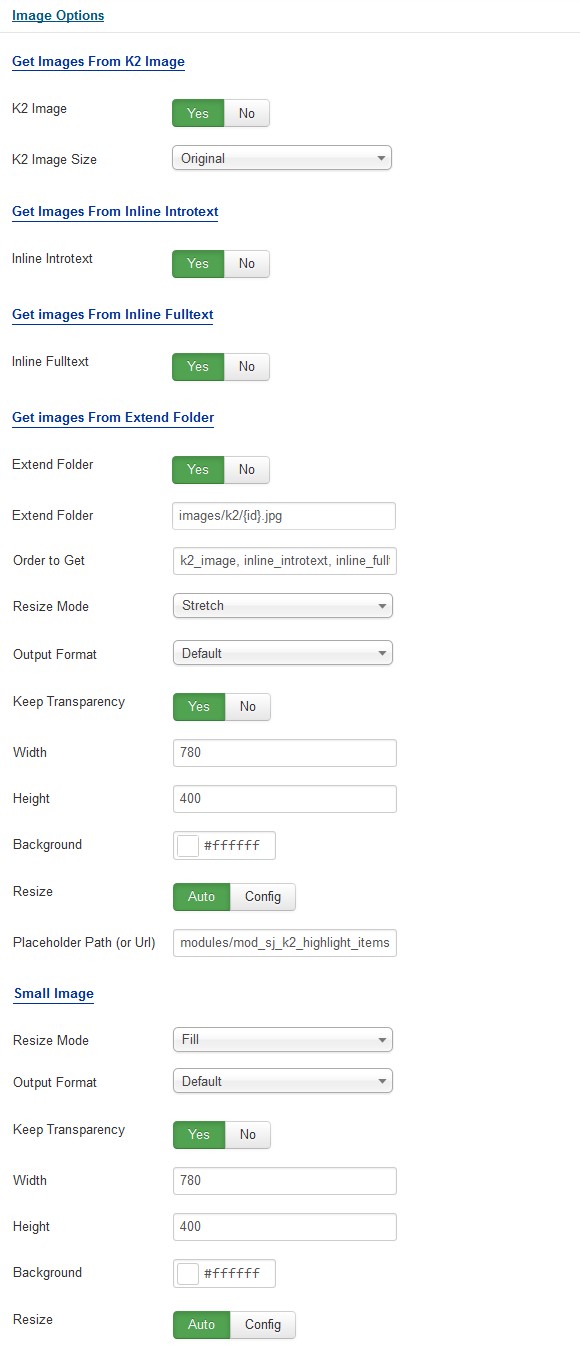
Image Options.
- Get Images From K2 Image
- K2 Image – Allow get image from K2 component or Not.
- K2 Image Size – Allow to choose image size in combobox.
- Get Images From Inline Introtext
- Inline Introtext – Allow to show/hide image of item.
- Get images From Inline Fulltex
- Inline Fulltext – Allow to show/hide image of item.
- Get Images From Extend Folder
- Extend Folder – Allow to show/hide Extend Folder.
- Extend Folder – Set path to external image folder used by option above.
- Order to Get – Order to Get image.
- Resize Mode – Allow to choose the mode of image resizing.
- Output Format – Output Format after resizing.
- Keep Transparency – Allow to keep transparency of image OR not.
- Width – Allow to set width of image.
- Height – Allow to set height of image.
- Background – Allow to set the color of image background.
- Resize – Allow to choose resize: Auto/Config.
- Place holder Path (or Url) – The path or URL of Default Image.
- Small Image
- Resize Mode – Allow to choose the mode of image resizing.
- Output Format – Output Format after resizing.
- Keep Transparency – Allow to keep transparency of image OR not.
- Width – Allow to set width of image.
- Height – Allow to set height of image.
- Background – Allow to set the color of image background.
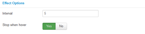
Effect Options
- Interval – Set to true to enable interval gesture support for advancing the slideshow forward or back.
- Stop when hover – Allow slideshow effect stop when hover OR not.
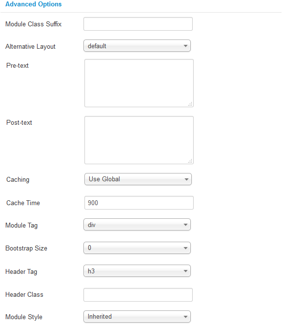
Advanced Options.
- Module Class Suffix – Allow to input class suffix.
- Alternative Layout – Set custom layout for this module.
- Pre-text – The content to show at the top of module.
- Post-texl – The content to show at the end of module.
- Caching.
- Use Global: Turn on caching
- No Caching: Turn off caching
- Cache Times – The time to cache.
- Module Tag – Allow to select the HTML Tag for module.
- Bootstrap Size – Allow to set the number of columns that module will use.
- Header Tag – Allow to select the HTML Tag for module header/title.
- Header Class – Support the CSS Class for module header/title.
- Module Style – Select module style.