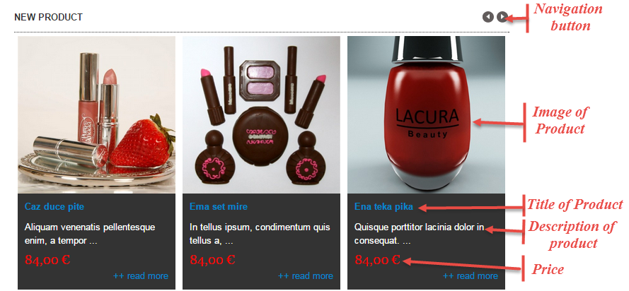
3.1 Below is module layout
3.2 Module Configuration
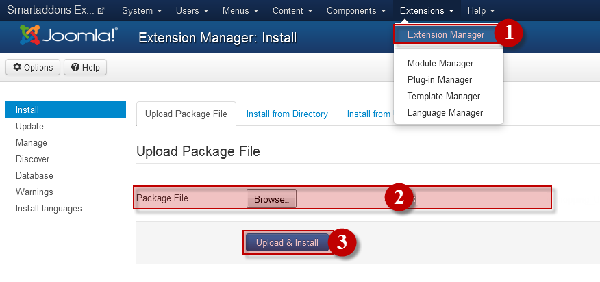
Note:We used the images of module’s installation on Joomla 3.x to illustrate.
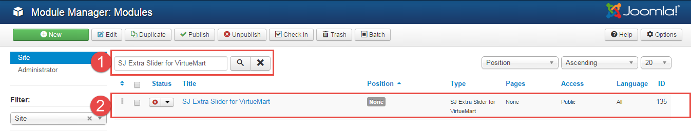
After installing, go to Extensions -> Module Manager and find SJ Extra Slider for VirtueMart to configure.
SJ Extra Slider for VirtueMart module is configured in 6 main groups of parameters as following:
- Module.
- Source Options.
- Item Options.
- Image Options.
- Effect Optionss.
- Advanced.
Let’s look at the parameters in detail:
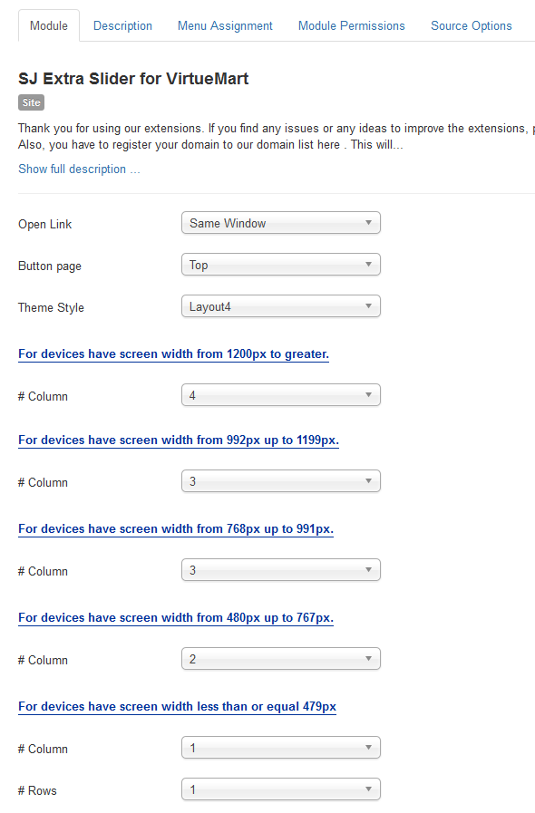
Module.
- Open Link – Allow to choose one of three:
- Same window.
- New window.
- Popup window.
- Button page – Allow to choose page’s button (top or under).
- Theme Style – Allow to choose theme style, we support 7 theme.
- # Column – Allow to set number of column for each device:
- For devices have screen width from 1200px to greater.
- For devices have screen width from 992px up to 1199px.
- For devices have screen width from 768px up to 991px.
- For devices have screen width from 480px up to 767px.
- For devices have screen width less than or equal 479px.
- Column – Allow to enter the column of product on a slider.
- Rows – Allow to enter the row of product on a slider.
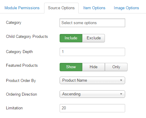
Source Options.
- Category – You can choose categories which you want to show.
- Child Category products – Allow to include or exclude products from child categories.
- Category Depth – The number of child category levels to return.
- Featured products – Allow to select to show, hide or only display Featured products.
- Product Order By – Allow to choose 1 of 7
- Product Name.
- ID.
- Best sales.
- Latest.
- Ordering.
- Product price.
- Random.
- Ordering Direction – Select the direction you would like products to be ordered by.
- Limitation – Maximum number of products to display. Enter “0” for unlimited.
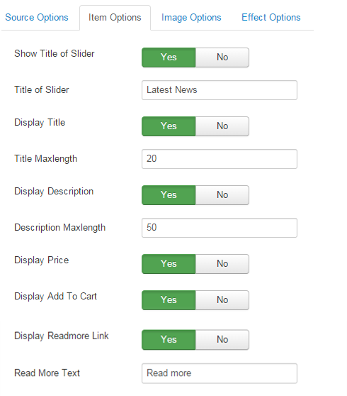
Items Options.
- Show Title of Slider – Allow to show/hide title of slider.
- Title of Slider – Allow to insert title of slider.
- Display Title – Allow to show/hide title of product.
- Title Maxlength – The maxlength of product’s title. Set “0″ to show full title..
- Display Description – Allow to display description of product OR not.
- Description Maxlength – The max length of product’s description can be showed.
- Display Price – Allow to show/hide price of product.
- Display Add To Cart – Allow to show/hide button add to cart.
- Display Read More Link – Allow to show/hide link for readmore.
- Read More Text – Allow to insert text for link of read more.
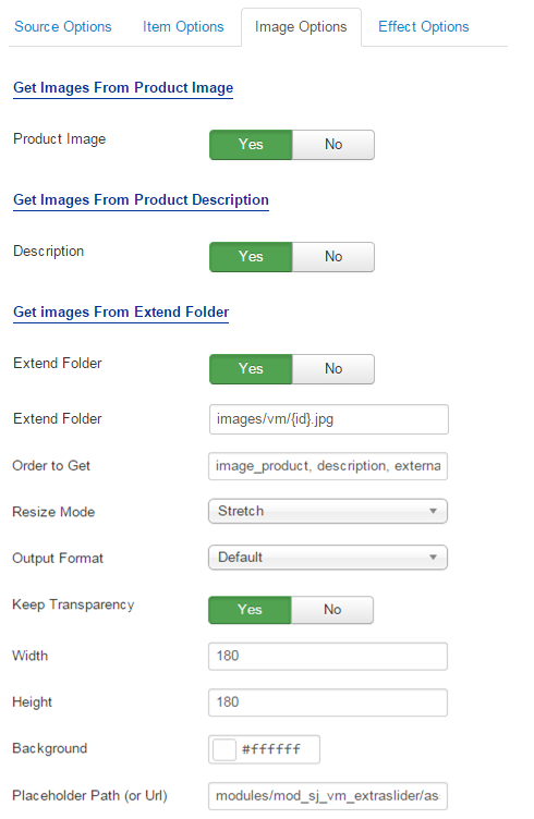
Image Options.
- Get Images From Product Image
- Product Image – Allow to show image product OR not.
- Get Images From Product Descriptionn
- Description – Allow to show image description OR not.
- Get Images From Extend Folder
- Extend Folder – Allow to show/hide Extend Folder.
- Extend Folder – Set path to external image folder used by option above.
- Order to Get – Order to Get image.
- Resize Mode – Allow to choose the mode of image resizing.
- Output Format – Output Format after resizing.
- Keep Transparency – Allow to keep transparency of image OR not.
- Width – Allow to set width of image.
- Height – Allow to set height of image.
- Background – Allow to set the color of image background.
- Place holder Path (or Url) – The path or URL of Default Image.
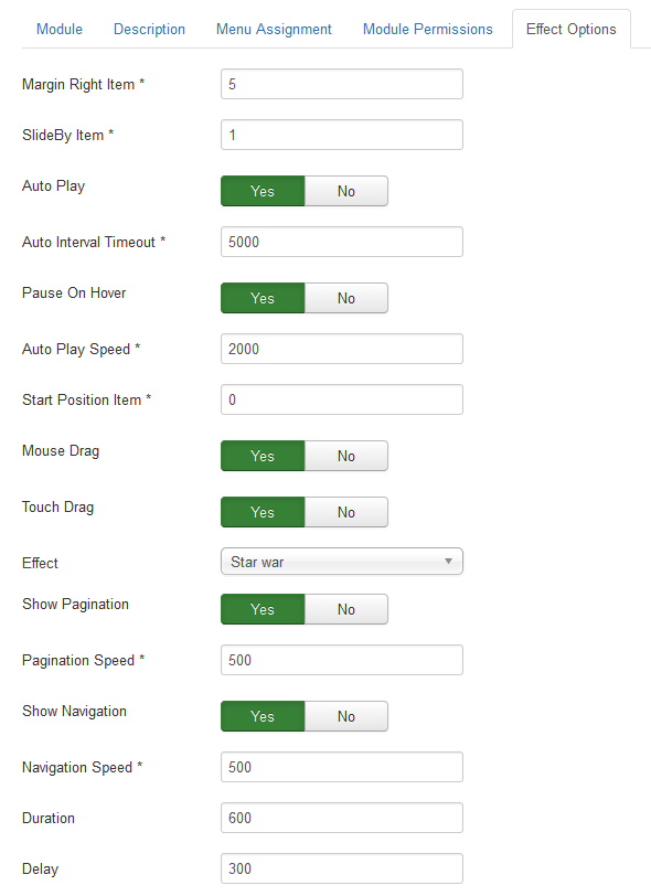
Effect Options.
- Margin Right Item – Allow to enter margin-right on Item (px).
- SlideBy Item – Navigation slide by x. page string can be set to slide by page.
- Auto Play – Allow to Enable/Disable autoplay mode.
- Auto Interval Timeout – Allow to set the speed of timer. Larger = Slower.
- Pause On Hover – Allow slideshow effect stop when hover OR NOT.
- Auto Play Speed – Allow to set speed of auto play.
- Start Position Item – Allow to Start position or URL Hash string like #id.
- Mouse Drag – Allow to Enable/Disable the mouse drag OR not.
- Touch Drag – Allow to set the touch drag on the smart devices OR not.
- Effect – Allow to choose the effect for the module.
- Show Pagination – Allow show/hide Pagination for slider.
- Pagination Speed – Allow to set Pagination Speed for slider.
- Show Navigation – Allow show/hide Navigation for module.
- Navigation Speed – Allow to set Navigation Speed.
- Duration – Allow to set how long animation will run (Lager = Slower).
- Delay – Allow to set a timer to delay the excution of the next item in the queue (Lager = Slower).
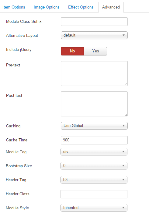
Advanced Options.
- Module Class Suffix – Allow to input class suffix.
- Alternative Layout – Set custom layout for this module.
- Include Jquery – Allow you to include Jquery OR NOT.
- Pre-text – The content to show at the top of module.
- Post-texl – The content to show at the end of module.
- Caching.
- Use Global: Turn on caching
- No Caching: Turn off caching
- Cache Times – The time to cache.
- Module Tag – Allow to select the HTML Tag for module.
- Bootstrap Size – Allow to set the number of columns that module will use.
- Header Tag – Allow to select the HTML Tag for module header/title.
- Header Classg – Support the CSS Class for module header/title.
- Module Style – Select module style.